
Just like with iOS, watchOS and iPadOS, Apple also releases a new version of macOS every year at WWDC, in June. Last year we had macOS Catalina, which was filled with bugs and stability issues, some of which still haven’t been fixed. I was honestly expecting the next macOS version to just be a stability improvement, over Catalina.
Since we didn’t had any leaks on the next version of macOS at all, pretty much the entire tech community was assuming that this would be a very small update. But instead, macOS Big Sur is actually the biggest macOS update that we’ve had in years snd probably the biggest update that macOS has had since the introduction of macOS X, in 2001.
So, without any further ado, here is my experience with macOS Big Sur!
Ok, so by far the biggest change that we got with macOS Big Sur is the new design. Unlike iOS, which usually gets a decent set of improvements every single year, macOS is a bit more conservative. For example, all versions of macOS, from macOS 10.0, to macOS 10.9, have looked almost identical.

Spot the difference
But in 2014, Apple released macOS 10.10 (Yosemite). This was the biggest design change that the Mac ever got, at least up until that point. Gone was the skeuomorphism that Steve Jobs was a big fan of, as now we got the same design language as on the iPhones and the iPads with iOS 7, back in 2013. A design that featured a heavy emphasis on transparency, 2D effects and simplicity. I was actually a big fan of this design, I literally had zero issues with it, but I always felt like it could be improved. And it was!
With macOS Mojave, in 2018, we got Dark Mode. This was one of my favourite macOS features ever and now with macOS Big Sur in 2020, Apple has redesigned macOS pretty much entirely again.
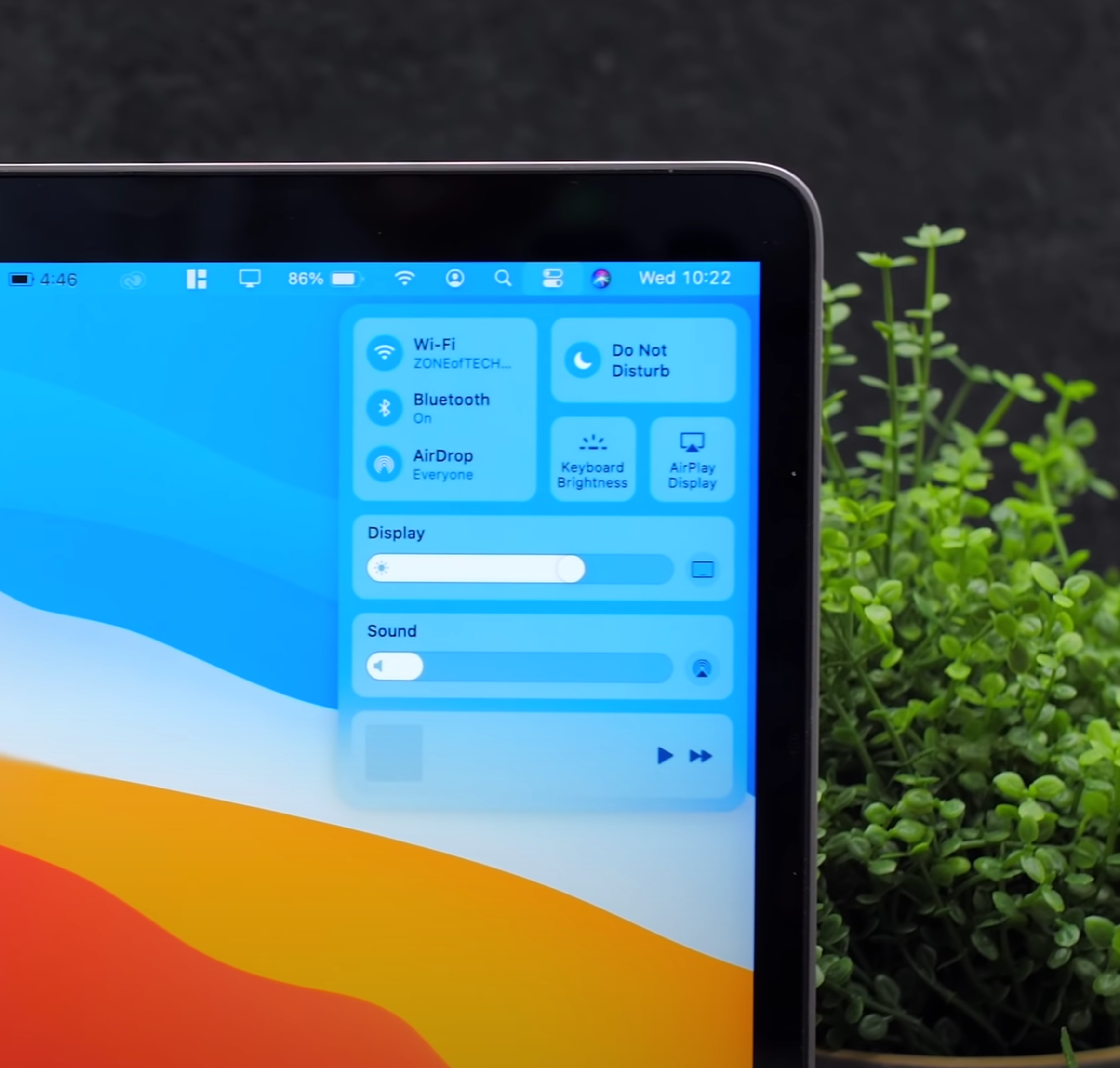
Essentially, we get an even more iOS like look with things such as Control Centre, the Notifications and Widgets panel from iOS 14 as well as System Toggles that look exactly like they do on iOS. I’m actually a massive fan of this Design. I think it looks absolutely gorgeous, however I do have some concerns that I want to raise, which hopefully Apple will address by the time macOS Big Sur releases to the public.
My first concern is the Contrast. On the current macOS Catalina, all the top bar Elements are perfectly visible. Everything looks pretty great, I’ve never had any issues identifying UI Elements. However, on macOS Big Sur, UI Elements are all over the place. The Contrast is almost entirely gone on the top bar, making everything barely even readable. Not only that, but Apple has also added more space between the Icons in the top bar. This means that for people like me, who have a ton of Icons there, many of those Icons would not be visible anymore due to the extra spacing required.
My second concern is the Control Centre. So, I do like how it looks and how it works a lot, you can even control the Screen Brightness from there and even things such as the Keyboard Backlight, which I think is absolutely brilliant as it just looks and behaves so much like iOS. I wouldn’t normally have a problem with this, if the device had a Touchscreen but…it doesn’t.
Whether this means that Apple will release TouchScreen Macs in the not too distant future, we do not know. But what we do know is that Big Sur behaves a lot like iOS and while using Big Sur with a mouse, it just doesn’t feel right.
Having a UI designed for Touch Input can have its’ upsides and downsides.
Now, speaking of the Control Centre, there are a lot of things that I like about it. For example, having the Control Centre means that you no longer need individual Icons in the top bar for things such as WiFi or Bluetooth. You can now keep all of those in the Control Centre, which does mean that you can indeed clear up a lot of space out there. But, probably my favourite thing about the Control Centre is that you can even drag elements outside of it and onto the top bar. So, if you ever wanted to have, let’s say, ‘Do Not Disturb’ Mode or even AirDrop in the top bar, that is now possible. On iOS, you can have third party apps in the Control Centre, I am predicting that this will also be possible later on, in macOS.
Next-up, Widgets are absolutely brilliant. They look and work exactly like they do on iOS 14, meaning that you can just add different sizes. These can be Small, Medium or Large and they’re fully interactive. My only complaint here is that I wish you could place them on the Desktop as well, rather than having them constrained in this separate Widget Panel. Essentially, just like you can on iOS 14, I think that being able to just drag them out of the Widgets Panel and onto the Home-Screen would be ideal, especially on a Mac, since you have a much larger Display, compared to an iPhone.
Notifications have also been tweaked. Rather than getting a massive list of all of your Notifications, they are now grouped into a stack which you can then expand to access all of them. Again, I just wish that they worked like they do on iOS or iPadOS. On iPadOS for example, you just bring the Mouse to the top portion of the screen and the Notifications Panel drops down. Apple is aiming for consistency between macOS, iOS and iPadOS, so I think it would be great to have Notifications work in the same way as they do on Apple’s other platforms.
My third concern is when it comes to UI Design. If you take a look at Finder, you can probably tell that it’s been completely redesigned. The Buttons are all in the window to the right, while the Side Panel alone is on the left and we have no control in that one at all. I really do like the way this looks, but the spacing is completely off.
So what about Calendar? The Spacing is completely different from Finder and System Preferences. Speaking of which, why is it still called ‘System Preferences’ and not ‘Settings’, like it is on iOS? I could keep adding to that list. For example with Siri, while it has indeed been redesigned on iOS and iPadOS, on macOS it still uses the same exact look as it did in macOS Catalina. There are many things left that Apple needs to polish, by the time macOS Big Sur releases.
Concern number four, are the Icons. In Big Sur, Apple decided to completely redesign the System Icons to essentially bring them more in line to iOS and I couldn’t agree more. I don’t know why we didn’t have identical Icons until now. But the problem is that they look atrocious. For example, while some Icons look identical as to how they look on iOS, like Calendar, Notes & Reminders, some Icons have this 3D look to them. Some examples include Messages, Mail, Face-Time and App Store, they also have an inner shadow.

The Icons are inconsistent in design, something I hope is addressed before release.
I’m honestly not a fan of this Design, I think it looks pretty bad, especially if you take a look at the System Preferences Icon or that horrid Battery Icon. These icons look like when you add Drop Shadow and Bevel & Emboss in Photoshop, if you know what I’m talking about. I wouldn’t necessarily be that critical of them, if they were all consistent, but they’re not. It looks as if each of these Icons was designed by a completely different person and none of these people were ever in touch.
Finally, my last concern is the Launchpad. First of all, why is it still called the Launchpad instead of the App Library like we now have on iOS? It’s essentially the exact same thing. Anyway, my problem here is that it’s still as painful and as slow, when it comes to organising your Apps. On iOS, you can indeed drag multiple Apps at the same time and place them in Folders. On macOS, you have to do it one by one, which is just a pain to do with a Mouse and even more so when you have loads of Apps installed, like I do.
Now, there are a few smaller features which I did find to be really cool so, here are a bunch of those features. I really do like how every UI Element has curved corners now, this also means that everything just looks off, when you look at the straight corners of the actual Display on your Mac. Because of this and the fact that the iPhone and the iPad both have curved corners, I do believe that the next Macs, starting with the new 14” ARM MacBook Pro, will indeed come with curved corners as well.
Also, remember that Battery Life indicator which also told you exactly how many hours of Battery Life you had left? Well, Apple removed that a while ago but now this seems to be back in Big Sur, which is great. The scheduling feature, which has been buried deep down into the Settings, is much more visible in the Battery section. You can even see your Battery Usage for the past day or week, just like you could for a number of years on iOS.

Everything about Big Sur just looks cleaner, but it’s not perfect.
Safari now lets you see how much websites track you. I’m pleased to say that we only use Google Analytics for tracking, so ‘ZONEofTECH.com’ is pretty tracker free, unlike many other websites out there. Speaking of websites, Safari now lets you watch Netflix in Full 4K Dolby Vision. Up until now, it was limited to 1080p.
Also iOS 14 does indeed support 4K Video playing on YouTube, albeit you have to be watching a 4K HDR Video, as you don’t really get the 4K option on non-HDR content. But, I am assuming that this will be fixed and it seems likely that we would also be getting 4K support in YouTube on the Mac as well with Big Sur, when it releases.
Speaking of Safari, you can now customise the Safari Home-Screen quite significantly. So now, not only can you customise the content that it displays by selecting and deselecting categories of items, but you can also have a custom Wallpaper in Safari, just like you can in Chrome. Apple will now be including the Safari Extensions in the AppStore and we also have a brand new API, which should make it much easier for Developers to develop and port their extensions from Chrome, into Safari. Safari is finally becoming more useful and I’m extremely happy with that.
I should also point out that I’m absolutely in love with the new Mail App. The UI has been cleaned up substantially and all the controls are now on the top right, with the left being reserved for the Side Panel, just like in Finder. This design actually reminds me a lot of Outlook, which actually had one of the very best designs for a Mail App.
The Calendar App has been redesigned as well, but I am still not a big fan of the Pastel Colours. I’ve always preferred the look of Google Calendar, maybe that’s just me. The Messages app also got a new Design, which brings in more in line with the iOS version, not just in terms of looks, but also in terms of its functionality.
Hopefully further support for more Apps comes in time.
So overall, I am a massive fan of how macOS Big Sur looks but like I’ve mentioned before, there are quite a few things that just need to be more polished and I’m really hoping that they will be by the time macOS Big Sur releases.
But in the end, macOS Big Sur isn’t just a massive visual upgrade, it is also a gigantic upgrade under the hood. It is the first version of macOS to fully support ARM Processors, which is the reason why Apple has also called it macOS 11. This lays the foundation of all future Macs that will feature Apple Processors. Speaking of that, Windows will not be supported.
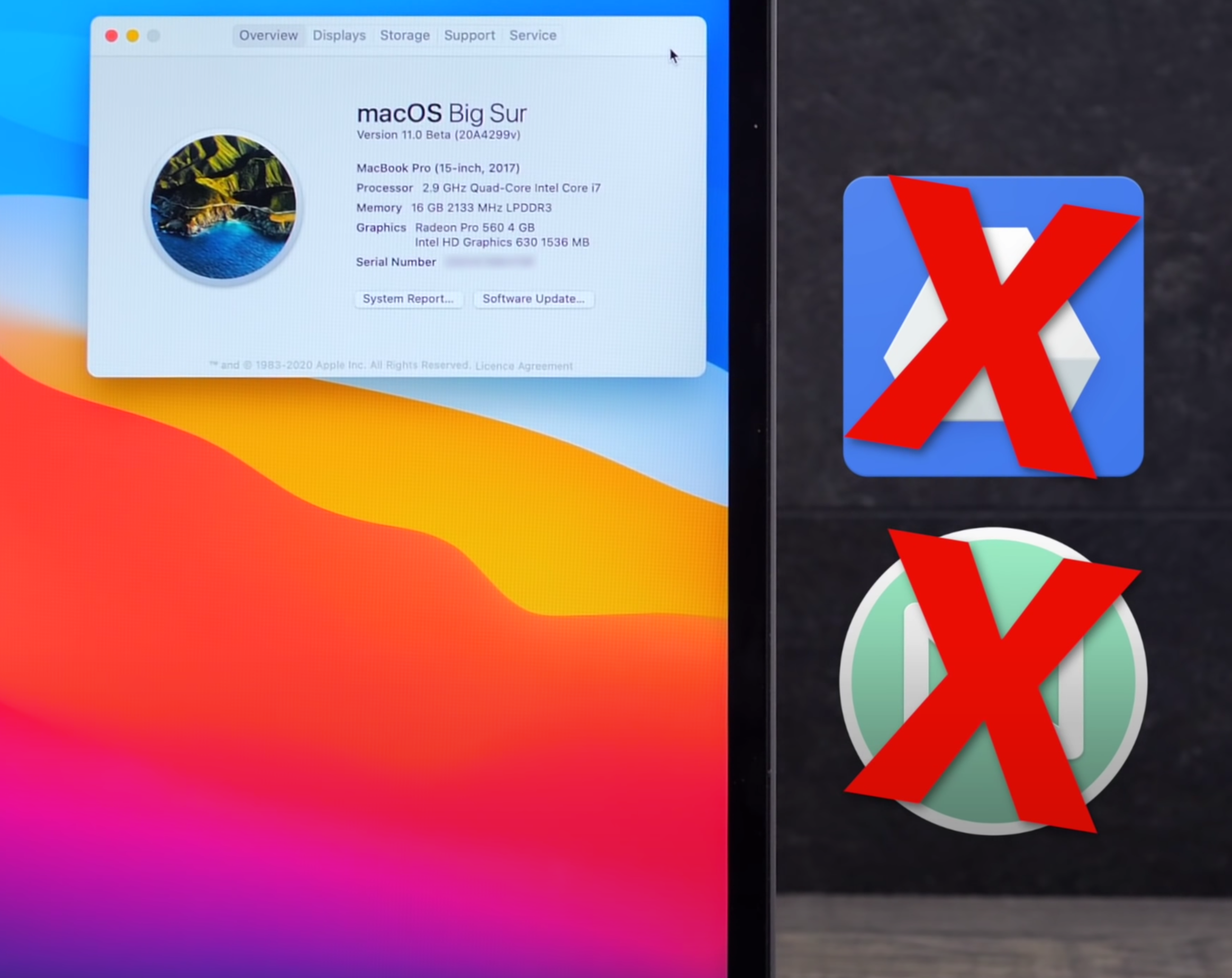
Just as a final note, some of you are probably wondering what is the performance is like? Well, unlike iOS 14, which I actually ended up installing on my own personal iPhone just because of how stable it was, I just could not do the same with macOS Big Sur. This was not necessarily because of stability issues, but mostly because of a number of my Apps that just don’t work on Big Sur, without receiving an update.
Google Drive File Stream, which we use a lot for our work here, does not work at all. Mailbutler, a great tool that I use with the native Apple email App does not work either as well as a few more.
These apps will only get updated closer to macOS Big Sur’s release, so I still have to wait a few months until I actually get to use it. Apple hasn’t really told us an exact date for when macOS Big Sur will be released. I would predict the end of October, as COVID has delayed pretty much everything. But I don’t think it would be any later than that though.