macOS

The Future of the MacBook Pro (2020 & Beyond)

The MacBooks are changing. Apple is on the verge of completely revolutionising the computing industry, not just in terms of the Macs, but also in terms of CPU Design.

We made a video back in June in which I talked about the switch to ARM in detail, so definitely give that video a watch if you want to learn more about the CPU itself. But here, I’ll be focusing on the future of the MacBook & MacBook Pro. We’ve had a ton of recent leaks that give us a glimpse at what Apple is aiming for with these devices, so without any further ado, here is The Future of the MacBook Pro (2020 and Beyond).


As most of you probably know already, Apple is ditching Intel in favour of their own Processors. Apple are already using their own Chips in the iPhones and the iPads so it makes a ton of sense to also use their Processors in the Macs, as that way they will have an entirely unified system.

So, what benefits will we get from this transition and how will these affect future Macs?


Performance

The most recent iPad Pro has shown us what Apple’s Chips are capable of.

The most recent iPad Pro has shown us what Apple’s Chips are capable of.

The biggest improvement that we’ll see is when it comes to the Performance. Apple’s A12X Processor, the one that’s inside the 2018 iPad Pro, is already more powerful than the 2020 MacBook Air and the baseline MacBook Pro. In fact, we even did a full video comparing the 2018 iPad Pro with the 2020 (high-end) 13” MacBook Pro in real-world tests such as Video Editing. The MacBook Pro exported a five minute, 4K60 timeline in 7 minutes and 27 seconds, while the iPad Pro only took 2 minutes and 52 seconds. Now, keep in mind that this was on a Tablet that was using a two year old Processor and didn’t even have a Fan. It was passively cooled and yet it was significantly thinner than the MacBook Pro, which had a Fan and was using Intel’s latest 10th Generation Processor. 

By Apple using a modern and more powerful A-series Chip, specifically designed for the Mac, they could significantly improve their Performance over even the iPad Pro. 


GPU and Memory

The use of SoC’s in Apple’s smaller devices greatly reduces latency between the separate components.

The use of SoC’s in Apple’s smaller devices greatly reduces latency between the separate components.

The second change would be when it comes to the GPU and of course, the Memory. 

On regular computers, such as a Desktop PC or a Laptop, the CPU, GPU and RAM (or the Memory) are all separate Components which are slotted into the Motherboard. The GPU, for example, uses a PCIe Interface to communicate with the CPU. The only problem here is that there is quite a bit of Latency when it comes to the CPU accessing the data from the GPU, which is determined by the speed of the PCIe Slot. Smartphone Processors, since there’s not that much room inside, actually combine all of these Components onto one single Chip, which is called a ‘System On a Chip’ (SoC). 

This is what Apple is using in their iPhones and iPads. Since the CPU now has direct access to the Memory and the GPU, the Latency is greatly reduced and therefore the overall Performance is greatly increased. I’ve had a look through Apple’s developer presentations for their upcoming transition to Apple Silicon and there was no mention of the GPU. In fact, Apple was even talking about how much they can improve the Performance by building an SoC inside their Macs. What this means is that we would not be getting any separate GPU options inside future MacBooks. This makes me wonder…what about the different SKU’s?


SKU’s 

Well, if we take a look at the Macs, there are many different CPU models that you can choose from. The MacBook Air has three CPU options: an i3,  i5 and an i7. But, the MacBook Pro has four options with the first two being Intel’s 8th Generation Chips, while the last two are Intel’s 10th Generation Chips. So, how many SKU’s will Apple have, when it comes to the next-gen Macs? If we take a look at the iPhone, Apple only releases one CPU model every year and all iPhones have that exact CPU model.

On the iPad side, we do have the X variant, which does pack more GPU power than the non-X variant that we get inside the iPhones. The last X variant that we got was back in 2018, so these do take a while to make and we only get those on the iPad Pro’s as the regular iPads still use the exact same Chips as the iPhones do. I think it’s pretty safe to assume that for the MacBooks at least, Apple will either have one SKU or two, at most.

The use of SoC’s will limit the amount of SKU’s and likely follow a pattern similar to the current iPad Pro’s.

The use of SoC’s will limit the amount of SKU’s and likely follow a pattern similar to the current iPad Pro’s.

My prediction is that the MacBook Air would be using the exact same Chip that the iPhones use, the Apple A14, and whatever comes next. While the MacBook Pros will be using a more powerful version of that to give them the “Pro’ name. Not only that, but I predict that the 13” and the 16” MacBook Pro would be identical in terms of the performance and the only advantage that the 16” model will have, would be when it comes to its Display Size, just like we have on the iPad Pro’s right now. We have two models, the 11” and 12.9”, both with the same Performance and the only difference being the Display size.

So, what about the RAM? Well, since the CPU would now be an SoC, it would be very difficult for Apple to give us multiple RAM options when we configure our MacBooks, like we get now. I believe that the MacBook Air would come with, like I said, an A14 Processor but more RAM than the iPhones do. Possibly 16GB of RAM, while the MacBook Pro’s would come with more than that. Maybe the 16” would come with 64GB of RAM by default and the 13’ would come with 32GB, that would be the one and only RAM option. As we know from the iPhone and the iPads, Apple’s Processors are extremely efficient in terms of Memory, and so is iOS, so you won’t need as much RAM as we have on the Intel Macs now. 


Design Changes

The next big change that this transition would bring, is when it comes to the Design. As Apple’s Processors are an entire SoC, you’re saving up a ton of space inside as there’s no need for a separate GPU and Memory. Not only that, but Apple’s Processors are also Fan-less. While Apple might add a Fan to some of their Macs to increase the Performance even further, by overclocking the Processors, the idea here is that they don’t necessarily require a Fan. Instead, they can use that extra internal space for a bigger Battery or a slimmer Chassis.

We sat down and brainstormed how Apple could design such a MacBook from scratch. This is our vision as to how we think Apple could realistically design a future MacBook now that they’ve made the transition to their own Processors.

We’ve modelled our own Concept of what we think these new MacBook Pro’s will look like.

We’ve modelled our own Concept of what we think these new MacBook Pro’s will look like.

We’ve designed the Display so that it matches the aesthetic of the iPad Pro. This means a uniform Bezel that also features curved corners which actually match the Design style of the upcoming macOS Big Sur. We’ve also made the Bezels a bit thinner than on the iPad Pro as we do think that those are indeed a bit too thick. This new MacBook Pro Design is finally in line with the modern 2020 Laptop Designs. The Aspect Ratio is still 16:10 and we’ve also added FaceID into the top Bezel as this has been recently leaked to be coming in all next-gen Macs moving forward. FaceID on a Mac makes so much more sense than having a TouchID Sensor. 

Now onto the Body. You can probably tell that this looks incredibly thin and that’s because we’ve actually used the same Body size as the iPad Pro. That means a thickness of only 5.9mm and a chassis that’s symmetrical and flat, so no more wedge shape MacBook Air style Design. We’ve added a USB Type C Port on each side and in case you’re wondering, these are indeed Thunderbolt 3 Ports, which are supported by the new USB 4 standard. So, Apple would not be losing Thunderbolt 3 by switching to their own Chips. We’ve also added two Speaker Grills on each side, with the same Design style as on the iPad Pro. 

The Trackpad is shorter now, as the Body is shorter as well, thanks to the Bezels being so thin now. This is how we designed it, but of course Apple could easily make the Display taller, maybe change the Aspect Ratio to a taller 3:2 Panel, just like on the Microsoft Surface Laptops, and have more room for the Trackpad in that case.

Colour-wise, we’ve kept Apple’s classic Space Grey and Silver colours but we’ve also added a brand new Matte Black colour, which I think looks amazing. I really hope that Apple gives us a darker colour option for this new generation as that’s definitely something that I would personally be going for.

For more Concepts and behind the scenes, be sure to check out our secondary ‘ZONEofCONCEPTS’ accounts on Instagram & Twitter.

For more Concepts and behind the scenes, be sure to check out our secondary ‘ZONEofCONCEPTS’ accounts on Instagram & Twitter.

When it comes to the Keyboard, obviously we have a Scissor Mechanism here but we have made the keys a bit thinner than on the current MacBooks, just to make it look better. Apple can easily keep the same thickness or just have the Keys deeper so that they travel more while also keeping this fairly thin Design, from the outside. The Touchbar is pretty much the same as before, so no changes here. The separate Escape Key is there, as well as an individual Backlight for each of the Keys. Apple, if you like what we’ve done, just get in touch.

Do let me know what do you guys think of our Design and if you want to see more of our concepts, it would be amazing if you could subscribe and also give us a follow on our ‘ZONEofCONCEPTS’ Instagram & Twitter pages. 

But, which MacBook is this? Is it the 12”, the Air or the Pro? Well, here’s what I’m thinking. Since Apple will have their own SoC now, and they’ll likely only have one or two SKU’s at most for these, they could unify the entire lineup, Design-wise. What I mean by this is that they could easily just call this the new MacBook, then have this in a 12” 14” and 16’ size, with the 14” and the 16” sizes being the MacBook Pro variant. These would also come with that more powerful A Series Processor that I mentioned, while the 12” would come with the same Chip that we have in the iPhones.

Personally, if I were Tim Cook, this is what I would do. I would create this beautiful singular Design, that would be instantly recognisable as a MacBook Design, and as use that for the entire lineup. Let me know in the comments what your thoughts are on this are. 


Battery Life

Another big improvement that the new MacBooks would feature thanks to the switch to Apple Silicon, is the Battery Life.

Battery Life is likely to get a huge bump in upcoming releases.

Battery Life is likely to get a huge bump in upcoming releases.

Most MacBooks from 2010 have claimed to offer a 10 hour Battery Life, which is exactly what the iPads have claimed since the original iPad came out in 2010 too. Personally, my iPad lasts me for about seven hours, while my MacBook Pro lasts me for around five hours. 

Apple leaker ‘KomiyaLeaks’ tweeted a few details about an upcoming 12” MacBook. I’ll get into these in just a bit, but probably the most surprising thing here is the Battery Life, which is now expected to be up to 20 hours. So, in real world usage, if we go by the iPad’s Battery Life, this should now translate into around 15 or so hours of actual usage, which is a pretty gigantic jump from the current five or so hours that I was personally getting. We’ve also had a leak on a supposed MacBook Air Battery, likely the new MacBook Air. This Battery is very similar to the one that we have on the current model, just with a brand new model number on it. 


Unified OS

Could a unified OS bring Touch Screen Support to future Macs?

Could a unified OS bring Touch Screen Support to future Macs?

The next big advantage of this transition, is a unified OS. Apple has already announced that iOS apps will now be able to be run natively, on the Mac. Meaning that you can run all of your favourite Apps, including ones that have zero optimisation, such as Instagram for example, directly on the Mac with no tweaking needed.

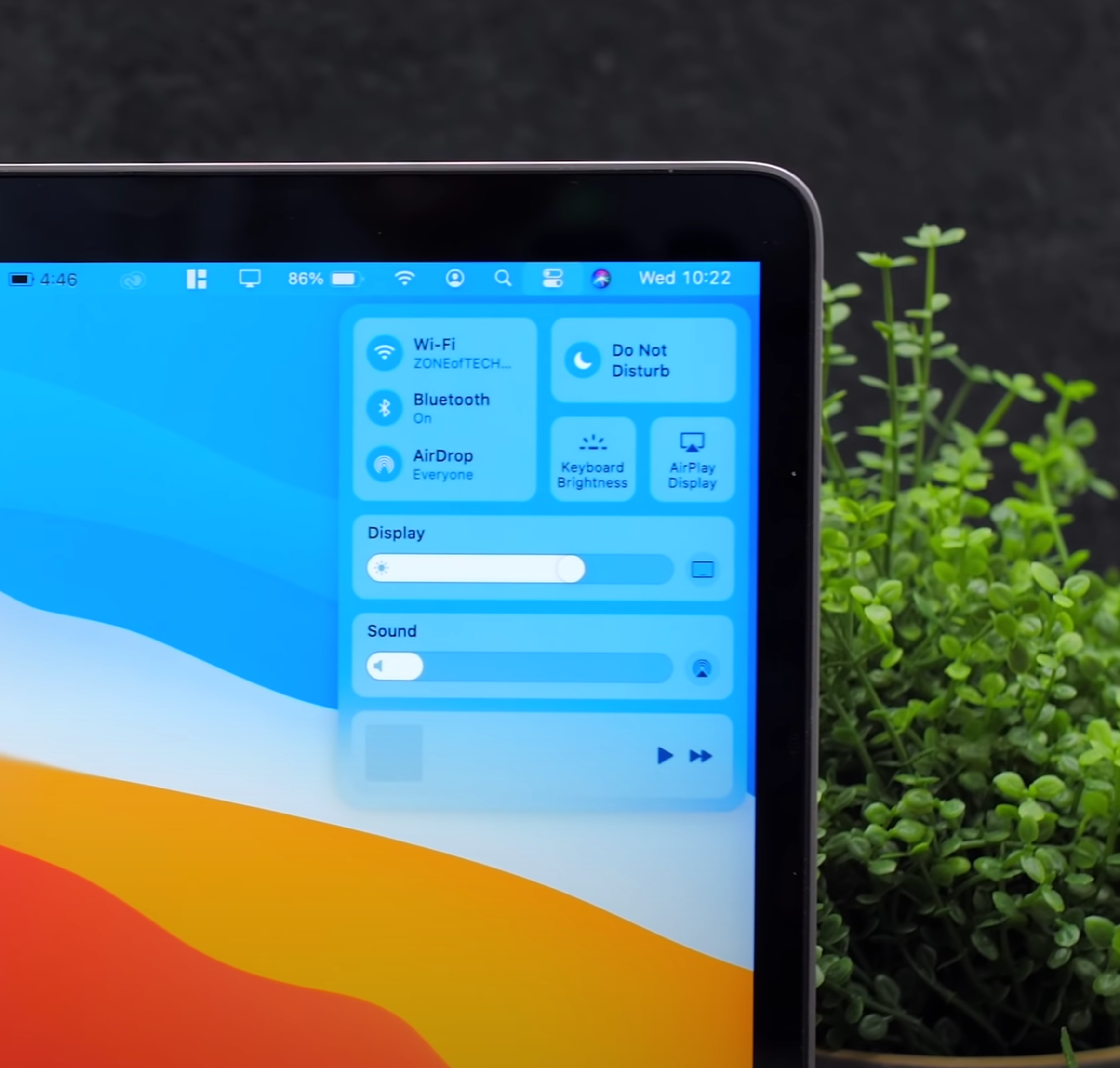
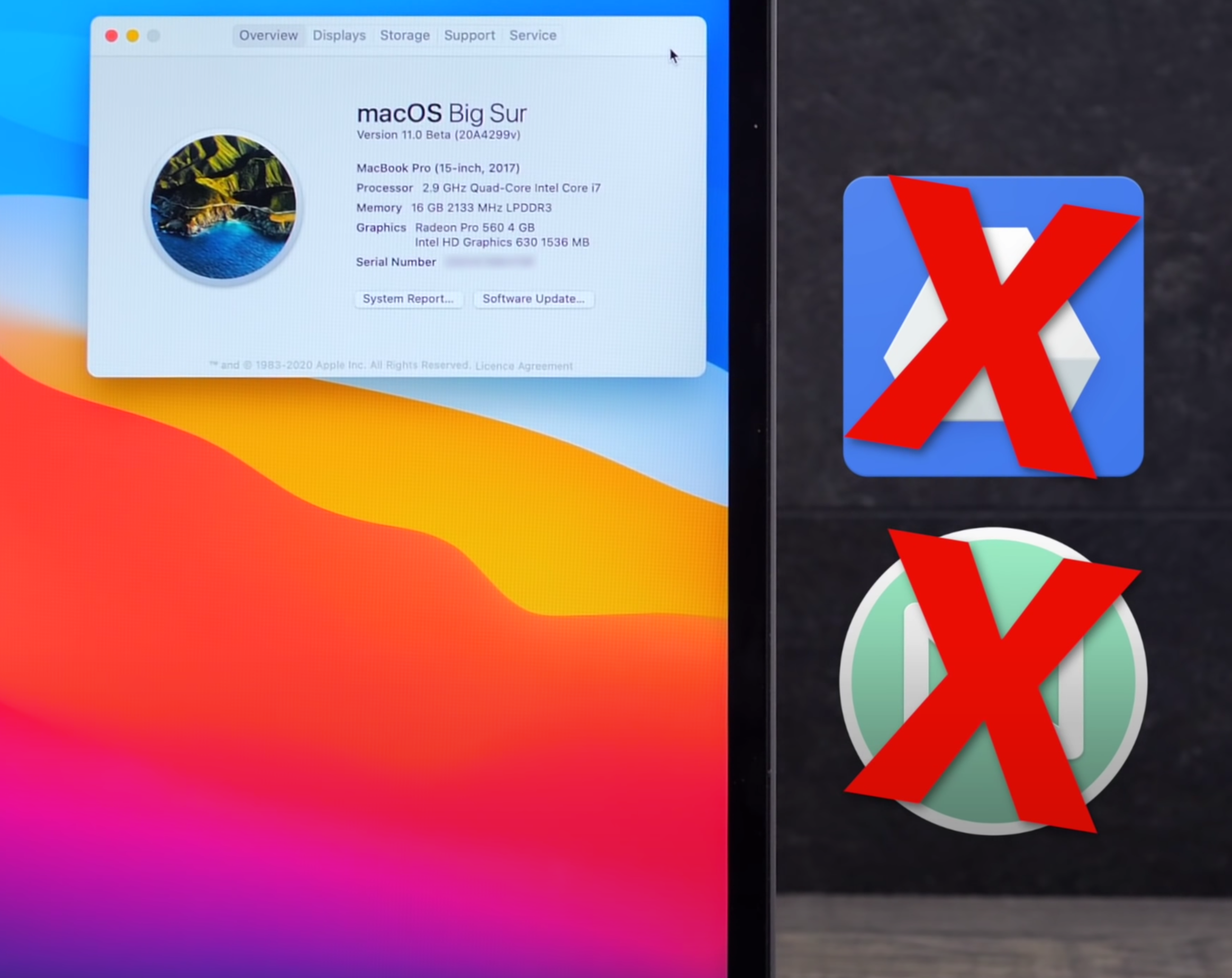
Apple has even demoed Final Cut Pro X and even Maya, running on a Mac Mini with an Apple A12Z Processor, the same Chip as in the 2020 iPad Pro, which is almost identical to the 2018 iPad Pro’s A12X Processor. This also means that iOS devices, such as the iPhone and the iPad, could easily run Mac software. Final Cut Pro X on the iPad is likely to be a possibility. In fact, Jon Prosser even stated a few months ago that XCode is actually coming to the iPad. This also makes me think that Apple could potentially add Touch-Screen support to the Mac, which would make a ton of sense as the iPad did get Mouse & Keyboard support. Also, macOS Big Sur does bring the Control Centre amongst other features, which are all Touch friendly. 


More Frequent Updates

I also expect to see more frequent updates to the Mac as Apple would not have to wait for Intel to release new Chips anymore. Instead, they can move the Macs to a yearly update cycle, just like they already do with the iPhones. 


Lower Prices 

Since Apple will be designing their own Chips, the prices of future Macs could in fact go down. ‘KomiyaLeaks’ reported that the new 12” MacBook would cost $800, making this the most affordable new MacBook that Apple has ever released. But at the same time, all the savings could go into Apple making these devices even better, so it’s not 100% guaranteed that the prices will indeed go down. 

In terms of what to expect in the near future, we’ve seen quite a few reports that we would see either a 12” MacBook or a new MacBook Air by the end of the year. Some reports even mention Apple releasing a 13” MacBook Pro with the same exact Design that we have now, just with an Apple Processor. Komiya reports that the Butterfly Keyboard will be coming back, which I personally don’t buy. He also reported that there is no Apple Event planned for October, which is where Apple would unveil these new Macs, so they could indeed be delayed until next year. What we do know for sure is that Apple is indeed planning some major redesigns with pretty much all of these upcoming Macs, including the iMac. 

iOS 14 Review - Biggest Change Since 2007!

Every year in June, Apple announces a new version of iOS, iPadOS, watchOS and macOS. We also have tvOS but come on, no one really cares about that.

This year, we had a few leaks that iOS 14 would bring a new Fitness App to the table, alongside possibly a new list view for the Home-Screen, but that was pretty much it. However, it turns out that iOS 14 is actually pretty much the biggest change that the iPhone has had since the introduction of the very first iPhone, back in 2007. This version of iOS (4) brought the ability to change the Wallpaper, as well as multitasking support. Then, iOS 7 redesigned the whole look and now iOS 14 allows you to have more than just Icons on the Home-Screen. 

It introduces Widgets and an App Library UI, amongst many massive features, making it a gigantic update. I’ve already covered over 40 big changes in our previous video, but now that I actually got a chance to use iOS 14 on my actual iPhone for a few days, I wanted to talk about my personal experience and how it actually is to use iOS 14, iPadOS and watchOS 7. So, without further ado, here is my iOS 14 experience!


iOS 14

Starting off with iOS 14 and the biggest feature that we got were the Home-Screen Widgets.

Now, we did kind of have Widget support with iOS 8, which came out in 2014. But these Widgets were only viewable in the Notification Centre. In more recent versions of iOS, you had to swipe right from the Home-Screen in order to see them, which was not that convenient. But now with iOS 14, you can place Widgets pretty much anywhere you want on the Home-Screen, which reminds me of Android.

This is so much cleaner, on the face of it.

This is so much cleaner, on the face of it.

In fact, Widgets support has been my number one most requested feature in iOS and it’s been one of the major reasons why I keep gravitating towards Android, whenever a major new device comes out. However, unlike on Android where you can basically place a Widget anywhere you want, on iOS they work in the same way as Apps do. They still magnetically attach to other Apps, which means that you just cannot have Widgets on the top, empty space in the middle and Apps on the bottom. You can only place Widgets where you already have Apps, which is a bit of a bummer.  

Also, you always need to have two rows of Apps between Widgets. For whatever reason, you just cannot have one single row, probably because Apple is using a 4x4 App Square for each small Widget. Something cool that I’ve noticed is that now you can just hold your finger anywhere on the Home-Screen to activate the Jiggle Mode, this is what it’s called internally. You also get this nice Haptic Response when you’ve done that. 

In order to add Widgets, you just press on the ‘Plus’ Button in the top right corner, you then get a bunch of automatic Widget suggestions, based on the Apps that you use the most. Once you scroll down, you get to this list of all the Apps that support Widgets. Since the Widget system has been completely redesigned in iOS 14, Apps will need to implement these Home-Screen Widgets, which is the reason why right now, only a few First-Party Apps support them. But then, it’s pretty straight forward. You select a Widget and then you get to choose between three or even four different sizes, in the case of Notes. Unfortunately, you cannot resize a Widget once you’ve placed it. In order to change the size of it, you’ll have to remove it and add it again. 

Now, if you choose to go for a small Widget, then that Widget would not be intractable. The moment you tap it, you would be taken to that App. Whereas if you have a larger Widget, with more UI elements, then you can click one of those elements to get taken to that specific function in the App. You can also hold on a Widget and then edit it with things such as changing the location that the Weather App shows you, the Note that’s currently displayed in the Notes Widgets and so on. 

You can also drag one Widget on top of another, to have a stack of multiple Widgets that you scroll through. It might be useful for some users, but for me personally, I like having all my information visible at a glance. I do prefer having all of my Widgets un-stacked and visible all the time.

Yes, ‘Jiggle Mode’ is the actual term for it.

Yes, ‘Jiggle Mode’ is the actual term for it.

Overall, I really do like the Home-Screen Widgets a lot and I just cannot wait for more Developers to start creating their very own Widgets. I predict that I would be changing my Home-Screen almost daily when that happens, by playing around with different Widget layouts. But unfortunately, Widgets are far from perfect. 

You cannot position them anywhere on the Home-Screen, for some reason Apple still kept the previous Widget View from iOS 13. Meaning that you can still swipe right from the Home-Screen and get this very long scrollable list with all of your Widgets. I just think that they should remove this because it just complicates things way too much for the average user. Having two places where you can have the same Widgets is just not ok. But wait, it gets even weirder.

In the Widget Panel, you can still hold to make them jiggle and then you have the same ‘Plus’ symbol, from where you can add more of them. It turns out that if you scroll down you still have the ‘Edit’ Button, from where you can add all the iOS 13 style Widgets here. Now, I really do hope that Apple fixes this in a future Beta Version. I do think that it will be fixed by the time iOS 14 launches, especially since all Widgets will be converted to the new style.

The second big new feature in iOS 14, is the App Library. Just like on Android again, where this is called the App Drawer, if you swipe left from your last Home-Screen, you can access the App Library, which is really just like the Launcher on Mac. A collection of all of your Apps installed on your iPhone. While I do like this idea a lot, unfortunately there are many issues and inconsistencies that I’ve found with the App Library. For example, on stock Android you get this App Drawer which lists and sorts all of your Apps alphabetically. Personally, I’m not really a fan of this as I do prefer having my Apps in Folders, which Samsung actually allows you to do in their own Android skin. which I love. Apple is somewhere in the middle.

The App Library does create App Folders, but those Folders are created automatically for you. There’s no way you can change that which means that finding a specific App can be quite tricky. Apple, please give us the option to rename and organise the Folders, as that would help a ton! 

Another mainstay on Android has come to iOS in the form of the ‘App Library’.

Another mainstay on Android has come to iOS in the form of the ‘App Library’.

The way it works now is kind of pointless as I can still better organise all of my Apps, by having custom Folders on the Home-Screen. Also, opening those Folders in the App Library is very confusing as well. Unlike the Folders on the Home-Screen, if you tap on an App, it just launches it. So, you need to press on the bottom right Icon that shows multiple Apps, in order to open up the Folder. Ok, so you’re probably wondering, what happens if you delete an App from the Home-Screen? Does it go to the App Library or does it get removed? So, once you get into Jiggle Mode, the ‘Delete’ option has been renamed into ‘Remove App’ and once you press that, you’ll be asked if you want to delete the App or add it to the App Library. Which again, is extremely confusing because all your Apps are already in the App Library anyway. I think this should be renamed into “Hide App” and “Remove App”. 

Back to the App Library. If you swipe up, you get this list view in alphabetical order, with all of your Apps. This is sort of like on Android and then you can scroll through them or even search through them, which I can already do that in Spotlight Search, but at least we get this list view, which I am a fan of. Those are the two big changes in iOS 14, Widgets and the App Library. While I do love both, I do feel like iOS is becoming a bit of a mess now. You can swipe right to access the Widget Panel which you can also add to your Home-Screen anyway. You can then swipe down to access the search functionality which you can also access by swiping left from your last Home Screen, but that search is only for Apps, whereas the swipe down search is for everything. I just feel like it needs a lot of polish as right now, it’s like a notebook full of ideas, instead of an organised Operating System.

There have also been a few extra things that I have noticed, which I do really want to point out. First off, the stability has actually been very good. I haven’t had any system crashes or anything really. It was a bit slow at first but after it indexed all the Apps, things got back to normal. It was so good that I even installed it on my personal iPhone and from all the Betas that I’ve used over the past ten years or so, iOS 14 is definitely the most stable. Battery life has been affected, but it’s nothing too severe.

The double-tap on the back functionality allows you to select a specific function that your iPhone will execute, once you double or triple-tap on the back. The way it works is that it uses your iPhone’s motion sensors to detect the tap on the back. However, because of this, my double tap functionality also got activated a few times when I laid my iPhone flat on my desk. The good news is that you can also have custom Siri short-cuts on this, meaning that you can pretty much assign anything you want to this double or triple tap Gestures. I’ve set mine to launch the Camera App as iOS still doesn’t have a quick Camera Launch functionality on the Volume or the Power Button. These gestures are a bit finicky to activate, but when they do work, it’s a pretty nice feature to have. 

A long-awaiting and welcome new feature, is 4K YouTube Content.

A long-awaiting and welcome new feature, is 4K YouTube Content.

Also, you can finally watch 4K YouTube content now, after so many years.

The reason why we couldn’t do it before was because Apple wasn’t using Google’s VP9 Codec and Google wasn’t using the h.265 that Apple was using. But now that the new AV1 Codec has been agreed to by both Apple and Google, and iOS 14 supports AV1, 4K playback is finally possible on Apple devices. But there is a catch. Google only seems to be using AV1 for 4K HDR videos, meaning that you can only watch 4K videos that are HDR. Otherwise, they’ll still be 1080p. I really hope that this gets fixed.

Speaking of things that need to get fixed. There’s now a way to adjust the exposure in the Camera App separately from the Focus, which is pretty great! We’ve had this in some third-party Apps as well. However, the way it currently works in iOS 14 has to be the most unintuitive way that I’ve seen. You can still adjust it via the up/down Slider when you’re focusing, but now you also have this Exposure Meter. The thing is, once you adjust it, there’s no reset button and you can increase/decrease the Brightness the same old way while the exposure meter is set to a custom value and that value won’t change. However, I’m pretty sure that this is a glitch though. 

In the Weather App, you can now see the AirQuality Index, which is pretty nice. Probably my favourite feature that I’ve found is that now you can hold the Navigation Buttons to go back to a specific previous category.  This really helps for when you’re buried deep into the Settings and you don’t want to keep going back and back until you get to where you want to be.

Siri now has a brand new UI, which I do like. You can now summon her without blocking the entire Display. However, what I don’t like is that you cannot interact with your Phone, whilst using Siri. Other than that, it’s more or less the same Siri as before. This UI now applies to whenever you’re getting a call. Rather than this blocking your entire Display, you get this notification-style window which you can even dismiss and continue doing your own thing.

‘App Clips’ is another thing that we’re looking forward to testing in the future.

‘App Clips’ is another thing that we’re looking forward to testing in the future.

Control Centre now allows you to show individual Accessories and Scenes from the Home App. Unfortunately, you cannot customise which Scenes or Accessories it shows you as this has all been automated, based on the ones that you use the most.

If you’re wondering how the AirPods pro sound, with that new 7.1 Surround Sound support, I won’t be able to tell you that because it seems that this is not available in Beta 1 just yet. Picture-in-Picture is though and it works just as you would expect it to, kind of. It doesn't work in the YouTube App so you have to be playing a video in Safari in order for that to work. But, it does work for Face-Time now, meaning that the person that you’re speaking to won’t get a black screen every time you go to check a Notification, but instead they’ll get to see you all the time, ands likewise.

Of course, there are many more features, such as App Clips, which I cannot test just yet. In terms of the big changes that I have noticed, these would be the main ones. 


watchOS 7

Moving on to watchOS 7, by far the biggest change here is Sleep Tracking and…I’m quite disappointed. The way it works is that you have this Sleep App and you select how many hours of sleep you want to get and when you need to wake up, it will then tell you when you have to go to bed. Right before that, you’ll have a ‘Wind Down’ period, which is usually around 45 minutes. This is when DND will automatically be enabled and that’s pretty much it. 

Your Apple Watch will estimate the Battery Life it would have, when you go to bed, and if that amount would be less than 30%, you’ll get a Notification to charge it. The only problem is that I never got that Notification, which I’m assuming will get fixed in the final version. Not only that, but Automatic Sleep Detection never worked for me. I had to manually put my Watch into Sleep Mode, rather than this being enabled automatically based on the sleep times that I’ve set it to. Again, I’m guessing that this will be fixed when iOS 14 comes out.

But probably my main issue with Sleep Mode is that you cannot really see your sleep stats, unless you go into the Health App and into the ‘Sleep’ section of that. Moreover, it doesn’t even tell you much, just the time you were in bed, which is literally based on when you tapped the ‘bed-time’ Icon and the time you were asleep. There are no mentions of sleep quality, REM data or anything like that. An App such as Sleep Cycle is so much better than the native Sleep Tracking is, as of right now.

Native Sleep Tracking will now be a thing, but there are already alternatives that do it better.

Native Sleep Tracking will now be a thing, but there are already alternatives that do it better.

Also, you’re probably wondering how much Battery Life it drains in Sleep Mode. Well, in my case, I had 51% Battery when I went to bed and 37% when I woke up about six-seven hours later. A 14% drop is actually very good, I just really hope that the Sleep Tracking gets smarter by the time this gets released. 

There is a new hand-wash feature which would show you a timer when it detects that you’re washing your hands. That’s not working just yet, or at least I could never get it to work, on my Apple Watch. 

Aside from that, the only new Watch-Face that we get, is the Chronograph Pro, which includes a Tachymeter that you can use to measure the speed that you are traveling at. I just wish this also had a digital version. You can also have complications on the X-Large Face, which is pretty nice to have and you can also add a Colour Filter to the ‘Photos’ Watch-Face. I also really do like how Apple has redesigned the Watch-Face customisation page and they now show you the colour selector on the right of the Face, rather than inside the Watch-Face.

There’s a new Workout for Dancing, but this was actually in watchOS 6. It was hidden in ‘Others’ and I’ve used it all the time for when I was playing ‘BeatSaber’. I’m not fully sure what’s new with this, possibly improved tracking?  But that’s pretty much it in terms of big, noticeable changes.


iPadOS 14

Finally, there’s also iPadOS 14, which is a very small update. Aside from ‘Scribble’, there’s nothing really that stood out to me. In fact, we don’t even get the Widgets from iOS, there’s still stuck in the Side Panel and we don’t have the App Library at all, which is extremely inconsistent.

While I do believe that these will be added by the time iPadOS releases, Craig Federighi indicated to Marques that this is how they’ve intended to release iPadOS 14, for now. So, we’ll see.

But that’s about it, macOS does have a lot of changes as well, just like iOS 14 did, but that’s an entire video in itself.

macOS Big Sur Review - A New Era for the Mac!

Just like with iOS, watchOS and iPadOS, Apple also releases a new version of macOS every year at WWDC, in June. Last year we had macOS Catalina, which was filled with bugs and stability issues, some of which still haven’t been fixed. I was honestly expecting the next macOS version to just be a stability improvement, over Catalina.

Since we didn’t had any leaks on the next version of macOS at all, pretty much the entire tech community was assuming that this would be a very small update. But instead, macOS Big Sur is actually the biggest macOS update that we’ve had in years snd probably the biggest update that macOS has had since the introduction of macOS X, in 2001.

So, without any further ado, here is my experience with macOS Big Sur!


Ok, so by far the biggest change that we got with macOS Big Sur is the new design. Unlike iOS, which usually gets a decent set of improvements every single year, macOS is a bit more conservative. For example, all versions of macOS, from macOS 10.0, to macOS 10.9, have looked almost identical. 

Spot the difference

Spot the difference

But in 2014, Apple released macOS 10.10 (Yosemite). This was the biggest design change that the Mac ever got, at least up until that point. Gone was the skeuomorphism that Steve Jobs was a big fan of, as now we got the same design language as on the iPhones and the iPads with iOS 7, back in 2013. A design that featured a heavy emphasis on transparency, 2D effects and simplicity. I was actually a big fan of this design, I literally had zero issues with it, but I always felt like it could be improved. And it was!  

With macOS Mojave, in 2018, we got Dark Mode. This was one of my favourite macOS features ever and now with macOS Big Sur in 2020, Apple has redesigned macOS pretty much entirely again. 

Essentially, we get an even more iOS like look with things such as Control Centre, the Notifications and Widgets panel from iOS 14 as well as System Toggles that look exactly like they do on iOS. I’m actually a massive fan of this Design. I think it looks absolutely gorgeous, however I do have some concerns that I want to raise, which hopefully Apple will address by the time macOS Big Sur releases to the public.

My first concern is the Contrast. On the current macOS Catalina, all the top bar Elements are perfectly visible. Everything looks pretty great, I’ve never had any issues identifying UI Elements. However, on macOS Big Sur, UI Elements are all over the place. The Contrast is almost entirely gone on the top bar, making everything barely even readable. Not only that, but Apple has also added more space between the Icons in the top bar. This means that for people like me, who have a ton of Icons there, many of those Icons would not be visible anymore due to the extra spacing required.

My second concern is the Control Centre. So, I do like how it looks and how it works a lot, you can even control the Screen Brightness from there and even things such as the Keyboard Backlight, which I think is absolutely brilliant as it just looks and behaves so much like iOS. I wouldn’t normally have a problem with this, if the device had a Touchscreen but…it doesn’t.

Whether this means that Apple will release TouchScreen Macs in the not too distant future, we do not know. But what we do know is that Big Sur behaves a lot like iOS and while using Big Sur with a mouse, it just doesn’t feel right.

Having a UI designed for Touch Input can have its’ upsides and downsides.

Having a UI designed for Touch Input can have its’ upsides and downsides.

Now, speaking of the Control Centre, there are a lot of things that I like about it. For example, having the Control Centre means that you no longer need individual Icons in the top bar for things such as WiFi or Bluetooth. You can now keep all of those in the Control Centre, which does mean that you can indeed clear up a lot of space out there. But, probably my favourite thing about the Control Centre is that you can even drag elements outside of it and onto the top bar. So, if you ever wanted to have, let’s say, ‘Do Not Disturb’ Mode or even AirDrop in the top bar, that is now possible. On iOS, you can have third party apps in the Control Centre, I am predicting that this will also be possible later on, in macOS.

Next-up, Widgets are absolutely brilliant. They look and work exactly like they do on iOS 14, meaning that you can just add different sizes. These can be Small, Medium or Large and they’re fully interactive. My only complaint here is that I wish you could place them on the Desktop as well, rather than having them constrained in this separate Widget Panel. Essentially, just like you can on iOS 14, I think that being able to just drag them out of the Widgets Panel and onto the Home-Screen would be ideal, especially on a Mac, since you have a much larger Display, compared to an iPhone. 

Notifications have also been tweaked. Rather than getting a massive list of all of your Notifications, they are now grouped into a stack which you can then expand to access all of them. Again, I just wish that they worked like they do on iOS or iPadOS. On iPadOS for example, you just bring the Mouse to the top portion of the screen and the Notifications Panel drops down. Apple is aiming for consistency between macOS, iOS and iPadOS, so I think it would be great to have Notifications work in the same way as they do on Apple’s other platforms.

My third concern is when it comes to UI Design. If you take a look at Finder, you can probably tell that it’s been completely redesigned. The Buttons are all in the window to the right, while the Side Panel alone is on the left and we have no control in that one at all. I really do like the way this looks, but the spacing is completely off.

So what about Calendar? The Spacing is completely different from Finder and System Preferences. Speaking of which, why is it still called ‘System Preferences’ and not ‘Settings’, like it is on iOS? I could keep adding to that list. For example with Siri, while it has indeed been redesigned on iOS and iPadOS, on macOS it still uses the same exact look as it did in macOS Catalina. There are many things left that Apple needs to polish, by the time macOS Big Sur releases.

Concern number four, are the Icons. In Big Sur, Apple decided to completely redesign the System Icons to essentially bring them more in line to iOS and I couldn’t agree more. I don’t know why we didn’t have identical Icons until now. But the problem is that they look atrocious. For example, while some Icons look identical as to how they look on iOS, like Calendar, Notes & Reminders, some Icons have this 3D look to them. Some examples include Messages, Mail, Face-Time and App Store, they also have an inner shadow.

The Icons are inconsistent in design, something I hope is addressed before release.

The Icons are inconsistent in design, something I hope is addressed before release.

I’m honestly not a fan of this Design, I think it looks pretty bad, especially if you take a look at the System Preferences Icon or that horrid Battery Icon. These icons look like when you add Drop Shadow and Bevel & Emboss in Photoshop, if you know what I’m talking about. I wouldn’t necessarily be that critical of them, if they were all consistent, but they’re not. It looks as if each of these Icons was designed by a completely different person and none of these people were ever in touch.

Finally, my last concern is the Launchpad. First of all, why is it still called the Launchpad instead of the App Library like we now have on iOS? It’s essentially the exact same thing. Anyway, my problem here is that it’s still as painful and as slow, when it comes to organising your Apps. On iOS, you can indeed drag multiple Apps at the same time and place them in Folders. On macOS, you have to do it one by one, which is just a pain to do with a Mouse and even more so when you have loads of Apps installed, like I do.

Now, there are a few smaller features which I did find to be really cool so, here are a bunch of those features. I really do like how every UI Element has curved corners now, this also means that everything just looks off, when you look at the straight corners of the actual Display on your Mac. Because of this and the fact that the iPhone and the iPad both have curved corners, I do believe that the next Macs, starting with the new 14” ARM MacBook Pro, will indeed come with curved corners as well.

Also, remember that Battery Life indicator which also told you exactly how many hours of Battery Life you had left? Well, Apple removed that a while ago but now this seems to be back in Big Sur, which is great. The scheduling feature, which has been buried deep down into the Settings, is much more visible in the Battery section. You can even see your Battery Usage for the past day or week, just like you could for a number of years on iOS.

Everything about Big Sur just looks cleaner, but it’s not perfect.

Everything about Big Sur just looks cleaner, but it’s not perfect.

Safari now lets you see how much websites track you. I’m pleased to say that we only use Google Analytics for tracking, so ‘ZONEofTECH.com’ is pretty tracker free, unlike many other websites out there. Speaking of websites, Safari now lets you watch Netflix in Full 4K Dolby Vision. Up until now, it was limited to 1080p. 

Also iOS 14 does indeed support 4K Video playing on YouTube, albeit you have to be watching a 4K HDR Video, as you don’t really get the 4K option on non-HDR content. But, I am assuming that this will be fixed and it seems likely that we would also be getting 4K support in YouTube on the Mac as well with Big Sur, when it releases. 

Speaking of Safari, you can now customise the Safari Home-Screen quite significantly. So now, not only can you customise the content that it displays by selecting and deselecting categories of items, but you can also have a custom Wallpaper in Safari, just like you can in Chrome. Apple will now be including the Safari Extensions in the AppStore and we also have a brand new API, which should make it much easier for Developers to develop and port their extensions from Chrome, into Safari. Safari is finally becoming more useful and I’m extremely happy with that.

I should also point out that I’m absolutely in love with the new Mail App. The UI has been cleaned up substantially and all the controls are now on the top right, with the left being reserved for the Side Panel, just like in Finder. This design actually reminds me a lot of Outlook, which actually had one of the very best designs for a Mail App.

The Calendar App has been redesigned as well, but I am still not a big fan of the Pastel Colours. I’ve always preferred the look of Google Calendar, maybe that’s just me. The Messages app also got a new Design, which brings in more in line with the iOS version, not just in terms of looks, but also in terms of its functionality.

Hopefully further support for more Apps comes in time.

Hopefully further support for more Apps comes in time.

So overall, I am a massive fan of how macOS Big Sur looks but like I’ve mentioned before, there are quite a few things that just need to be more polished and I’m really hoping that they will be by the time macOS Big Sur releases.

But in the end, macOS Big Sur isn’t just a massive visual upgrade, it is also a gigantic upgrade under the hood. It is the first version of macOS to fully support ARM Processors, which is the reason why Apple has also called it macOS 11. This lays the foundation of all future Macs that will feature Apple Processors. Speaking of that, Windows will not be supported.

Just as a final note, some of you are probably wondering what is the performance is like? Well, unlike iOS 14, which I actually ended up installing on my own personal iPhone just because of how stable it was, I just could not do the same with macOS Big Sur. This was not necessarily because of stability issues, but mostly because of a number of my Apps that just don’t work on Big Sur, without receiving an update.

Google Drive File Stream, which we use a lot for our work here, does not work at all. Mailbutler, a great tool that I use with the native Apple email App does not work either as well as a few more.

These apps will only get updated closer to macOS Big Sur’s release, so I still have to wait a few months until I actually get to use it. Apple hasn’t really told us an exact date for when macOS Big Sur will be released. I would predict the end of October, as COVID has delayed pretty much everything. But I don’t think it would be any later than that though.