I’ve been using the Samsung Galaxy Note 20 Ultra for almost two months now and during this time, I’ve tested it to its fullest and now I am finally ready to give you guys the full, in-depth ZONEofTECH Review.
As you probably know, I test my devices for about a month, sometimes even more, before publishing our Review. So, even-though we’re never the first, we do try to make our Reviews as comprehensive as possible.
Therefore, this Review contains nine different sections:
Lineup
Design
Display
Camera
Performance
Special Features
Software
Battery Life
Value
Spoiler alert, the Note 20 Ultra is literally the highest-end, non-foldable Smartphone that you can buy right now, but it does have some issues. Get all those snacks ready, drinks as well, sit back and relax as this is going to be quite the Review.
Line-up
Starting off with the line-up and just like last year, where Samsung had two models of the Galaxy Note (the Note 10 & the Note 10+), Samsung now has the Note 20 and the Note 20 Ultra, with the ‘Ultra’ being the new ‘Plus’. This year, there are far more differences between the two models than in 2019.
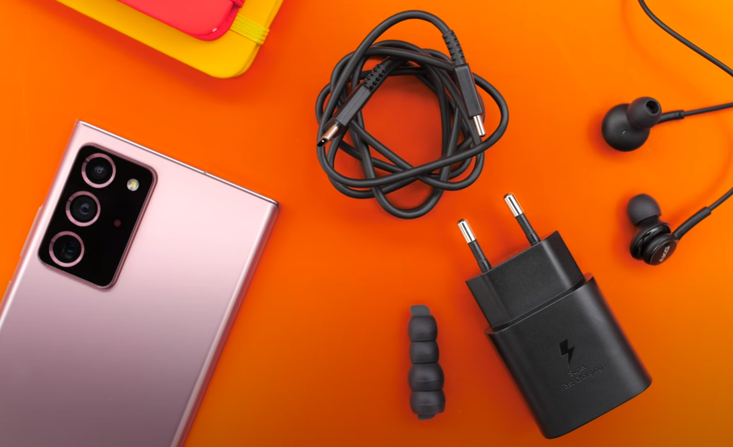
Not quite iPhone 12 levels of barebones, but the box contents have been slimmed down.
The regular Note 20 comes with a 1080p Display with a 60Hz Refresh Rate, an inferior Camera, a higher latency for the S-Pen and, more importantly, it comes with a Plastic back. All this for $1,000. It is pretty safe to say, do not buy the Note 20. I feel like the only reason why that Phone exists, is to push consumers to buy the Note 20 Ultra, which offers so much more, for $300 more.
Unfortunately, this year, Samsung has cut down on the stuff you get inside the box by quite a lot. Even with the Note 20 Ultra, there are no S-Pen tips in the box anymore, which I find quite odd. There are also no Headphones if you live in the US. You do still get headphones everywhere else though. You don’t get the case in Europe and the US, but you do actually get it in some other regions. Definitely keep this in mind, that Samsung is offering different things for different versions of this Phone, as it will be a recurring theme throughout the Review.
Design
Design wise, I was a massive fan of the Note 10+ from last year. That squared-off look and those sharp corners made it, in my eyes, the most beautiful Phone ever made. The Note 20 Ultra is even better now.
Gone is that super shiny and finger-printy Glass on the back and instead we get a Frosted Glass back, just like the iPhone 11 Pro’s, the Pixel 4, the OnePlus Phones and some others as well. The Samsung text on the back is engraved and it has a different texture than the rest of the Phone. For some reason, there is actually an engraved PO Number on the back of the Phone, which is quite interesting and funny at the same time. Unfortunately, we only get this Frosted Glass back on the Mystic Bronze colour. If you get the Black or the White one, they still come with regular Glass, which is a bummer for me as those would have been my personal colour choices.
Samsung has changed the position of the S-Pen, it is now on the left rather than on the right-hand side, which is quite inconvenient if you’re right handed so I’m actually not a fan of this at all. What I am a massive fan of though, is having both the Power and the Volume Buttons on the right-hand side. This way you avoid taking accidental screenshots, like you do on the iPhone, I can’t believe they still haven’t fixed that.
Not that it was small to begin with, but the Display size has increased.
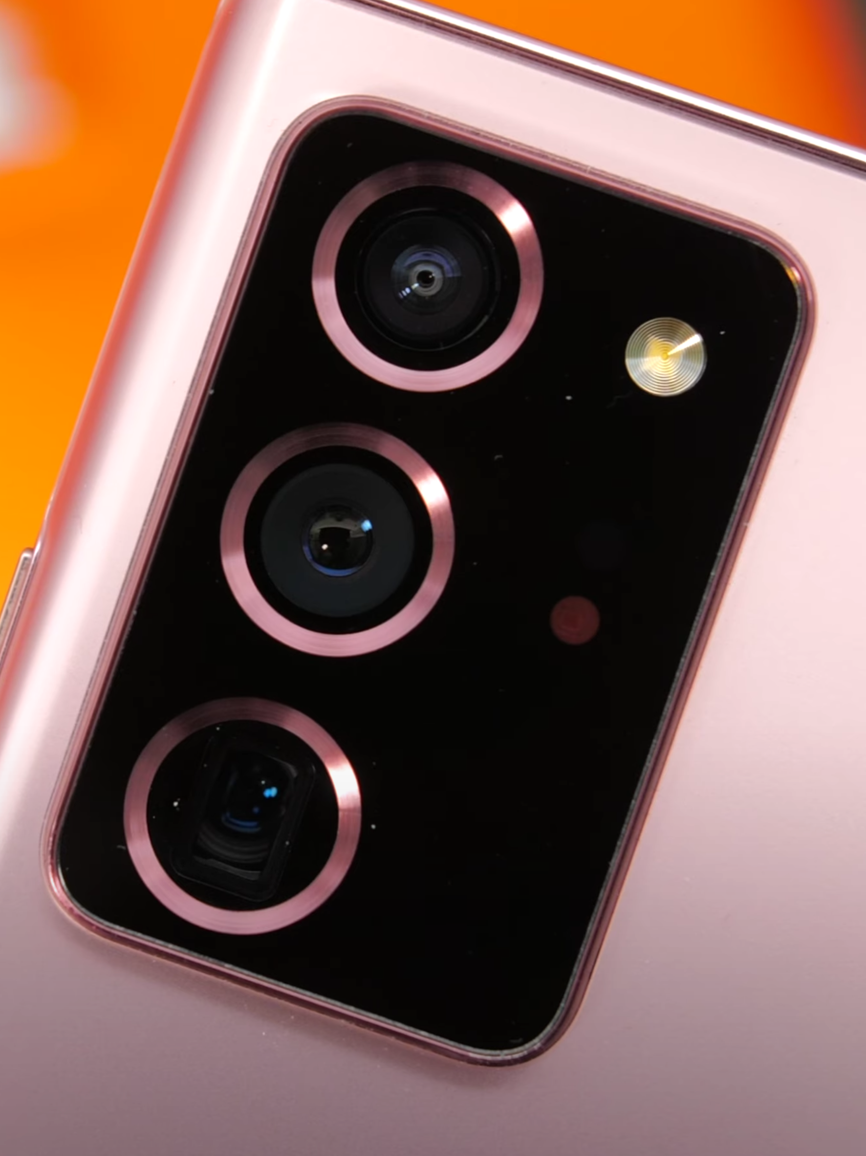
Aside from the texture on the back of the Mystic Bronze unit, Samsung has also updated the Camera Module’s Design. We get a similar style to what the S20 Ultra came with, more about the Camera once we get to that section, but now we also get these beautiful metal rings that surround the Modules which also match the colour of the Phone. Something else that I like about this Camera Module, which is just humongous in terms of both the size and the thickness, is that I can actually rest my finger underneath it and kinda use it as a pop-socket. This makes the entire Phone much more comfortable and easier to use. I’m not sure if this was intended by Samsung or not, but it is definitely a welcome ‘feature’.
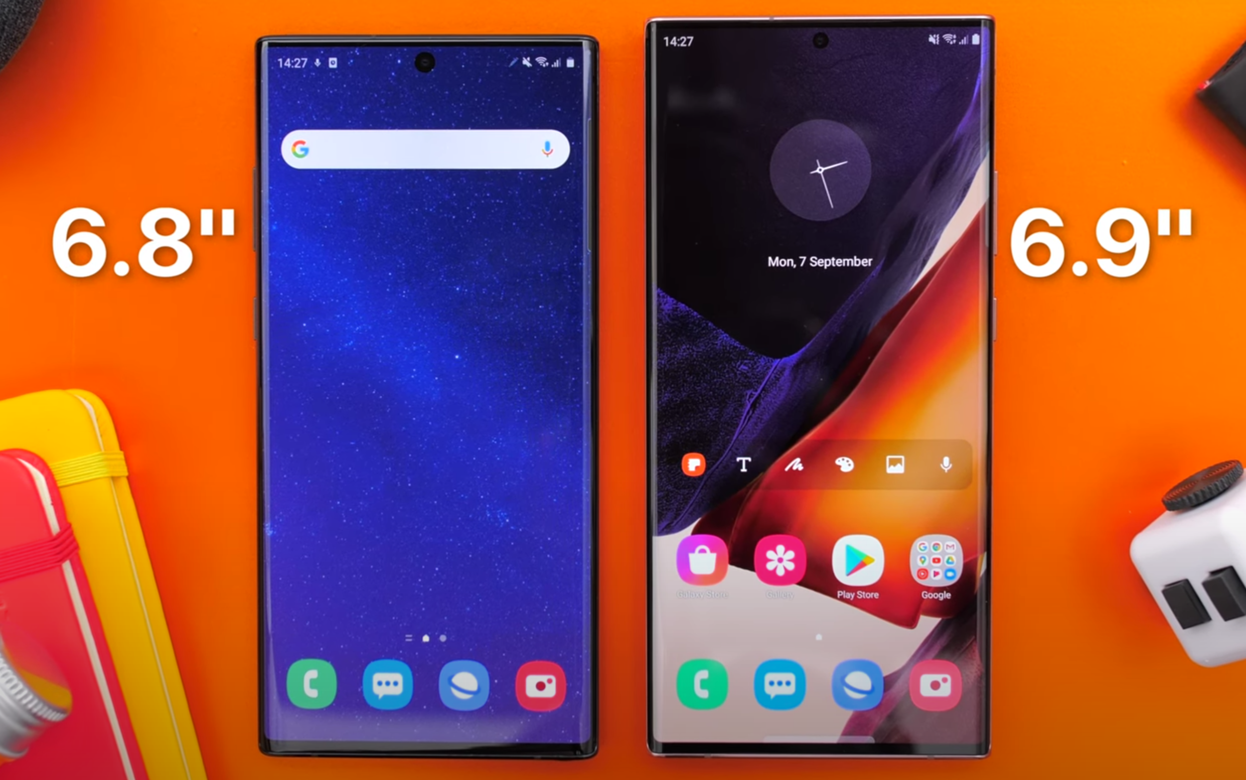
Now, I have to say, if you’re not into big Phones, then this is not the Phone for you by any means. With a massive 6.9” Display, up from the already big 6.8” Panel of the Note 10+ from last year, a 0.2mm increase in thickness as well as a 12g increase in weight, the Note 20 Ultra is noticeably bulkier than the Note 10+. This is without me even taking that super thick Camera Module into consideration. Speaking of that Module, the Note 20 Ultra now wobbles on the table like crazy, because of it. So, if you’re the kind of person that uses their Phone flat on the table a lot, you still can on the Note 20 Ultra, it’s just that it is going to be super frustrating because of that wobble.
Also, when you compare the Note 20 Ultra against some of the other big Smartphones on the market, such as the iPhone 11 Pro Max, the S20 Ultra and the Huawei P40 Pro, the Note 20 Ultra is still the big boy here. Also, whilst I am indeed a big fan of the squared-off form factor, it did end up hurting my palms after using it.
Overall, I do think that this is the most beautiful Phone on the market right now. Both from the front, with that full screen Bezel-less Display, as well as from the back, with that new Frosted Glass look.
My only complaints Design wise are, firstly, the fact that the Frosted Glass look can only be found on the Mystic Bronze colour and also, with it so big and having those squared-off edges, it is honestly the most uncomfortable Phone I’ve ever held in my hands.
Display
So, what about the actual Display? Well, just like with the Design, I do consider this to be the most impressive Display on any Smartphone at the moment. Not only is it larger now, but it is also taller, meaning that it can display more vertical content as well as being brighter. Samsung claims that it can go up to 1,500 Nits of peak Brightness, as opposed to about 1,250 Nits on the Note 10+.
We’ve used our professional XRite Display calibration & measure tool, measuring a peak Brightness on a 100% White Window of 977 compared to 530 on the Note 10+, or 780 on the iPhone 11 Pro Max. This is similar to what you would get outdoors, when browsing a website, as those do usually have a white background. DisplayMatte measured this Display up to 1,609 Nits of Brightness on a 10% White Window. Outdoors, I haven’t really been able to notice that much of an improvement over my iPhone 11 Pro Max. The Note 20 Ultra was perfectly visible outdoors though, even in direct sunlight, but it wasn’t noticeably brighter over any of the previous Phones that I’ve used before, at least not to my eyes.
The Note 20 Ultra, same as the Galaxy S20 series, now has a 120Hz Refresh Rate. As with the S20 series, you have to turn down the Resolution to 1080p if you want to use 120Hz. It still cannot do full Resolution at 120Hz, like the OnePlus 8 Pro (and many other Smartphones) can, which is a bit of a bummer. The good news however, is that I wasn’t able to see that much of a downgrade in Sharpness when using this in 1080p mode. Text is indeed a bit blurrier but not by as much as I was expecting.
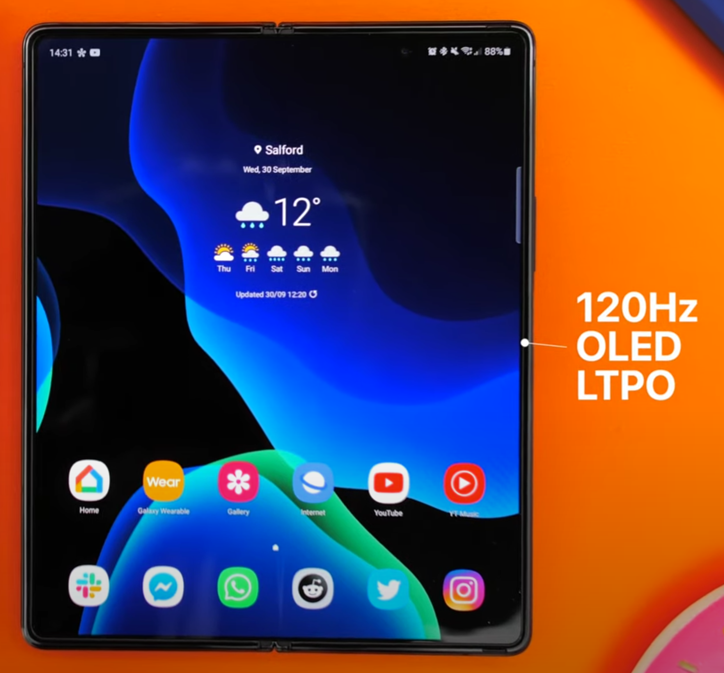
The Z Fold 2 is the only other Smartphone to have this quality of Display.
Something new with the Note 20 Ultra, is the LTPO Panel, making this and the Galaxy Z Fold 2 the only two Smartphones out right now that come with a 120Hz OLED LTPO Display. What this means is that the Note 20 Ultra can dynamically adjust its Refresh Rate from 1Hz, all the way up to 120Hz, based on the content that you’re watching, which does help preserve the Battery.
I also love how the Display is still curved here too. I know that some people prefer having a flat Display, like we got on the regular Note 20 or the S20 Ultra, but personally I really do like the way this Display looks. Also, I haven’t really had any accidental touch rejection issues with the Note 20 Ultra, maybe just a few when watching videos on YouTube, but nothing major. Let me know in the comments if you prefer having a flat or a curved Display.
The colours on this are absolutely outstanding. The fact that we get an even higher brightness really shows the most when you’re playing back HDR content, HDR video on this simply looks breath-taking. Overall, I would very confidently say that this is the best screen on any Smartphone out right now. It’s very bright, colours are incredible and the viewing angles are superb on this. HDR content is noticeably better than the same content being played back on the iPhone 11 Pro Max or even the S20 Ultra from just a few months ago.
Now, something that this Display comes with, is Gorilla Glass 7, aka Gorilla Glass Victus. This provides up to a 2m drop resistance, up from 1.6m, as well as double the scratch resistance of Gorilla Glass 6. It’s not perfect, it’s not scratch-proof, but it is a noticeable improvement over anything that I’ve used in the past. My only complaint regarding the Display is the fact that we still don’t have 120Hz at Native Resolution. Other than that, this is the best Display that I’ve seen on a Phone.
Camera
So, what about the Camera? Well, buckle up because I have a lot to say here.
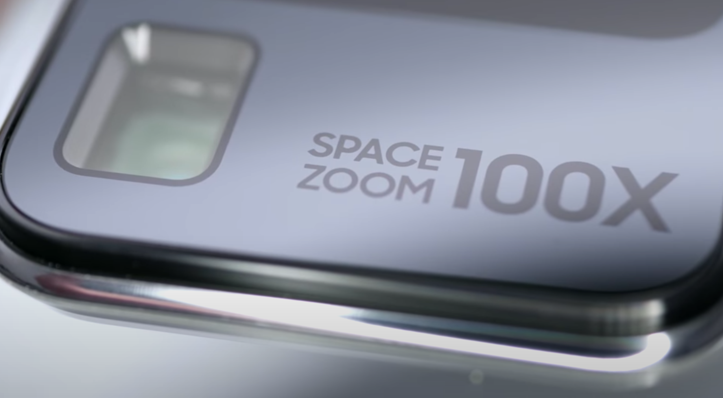
The Camera on the Note 20 Ultra is mostly identical to the one on the S20 Ultra, and that’s a good thing, right? If you’re aware of the S20 Ultra, you’re probably also aware of the very negative Reviews that this Phone received. There were two reasons for why that was. Firstly, the price. At a starting price of $1,400 and with promises such as a 108MP Resolution camera, 100X Space Zoom, 8K Video Recording and more, this Phone seemed like it was going to be the god of all Phones. Especially the Camera. Unfortunately, it had a lot of issues, with the main one being the Camera.
That 108MP Module was very poor in Low Light, it had focusing issues, 100x Space Zoom was basically unusable at 100x Zoom as everything looked like water-paint and 8K Video Recording was nice, but it was choppy. Not even to mention the pretty serious HDR Processing issues that it had to the point here the Galaxy Note 10 and S10 from a year prior, actually had a better Dynamic Range with many other Reviewers complaining about this too.
With all of this, you would expect Samsung to just completely revamp the Camera in the Note 20 Ultra, but it turns out, this is mostly the exact same Camera that the S20 Ultra had. Luckily though, Samsung has actually fixed most of the issues this time. The Main Module is literally the exact same 108MP Sensor that we got with the S20 Ultra. Night Mode has been significantly improved, even photos of the Moon have a gigantic improvement from where the S20 Ultra was, at launch. Even when it comes to Low Light video, the Note 20 Ultra does indeed look better than the S20 Ultra did, 8K Video Recording is about the same, it’s sharp but still choppy, so I wouldn’t really be using this myself.
There are a lot of similarities to the S20 Camera, but it’s not all bad news.
HDR Processing has also been significantly improved. The Dynamic Range still isn’t as good as on the iPhone 11 Pro Max or the Pixel 4 XL, but it is a major improvement over the S20 Ultra. My main issue was really that Dynamic Range, so I’m glad to see that this has gotten a big improvement over the S20 Ultra’s Processing.
Something that I also absolutely love about this 108MP Main Module is that you get a natural Depth of Field, pretty much Portrait Mode but fully done through hardware, rather than through software. Photos taken on this Phone literally look like photos taken on a DSLR or Mirrorless Camera, they’re that good. You can also take photos in 108MP Resolution, which results in some insanely sharp photos.
Unfortunately, the CPU isn’t fast enough to process the 108MP photos that quick and also do all the machine learning required to make them look better. So, you’ll notice that all the 108MP photos will lack that HDR Processing all together, the shadows will often be crushed and the highlights overexposed. The regular 12MP photos, which are actually using an 8:1 Pixel Binning method to combine eight pixels into one, don’t have this issue.
Another issue that the S20 Ultra had, was Focusing. That massive 108MP Sensor lacks the Dual Pixel Autofocus that made Samsung Phones the fastest on the market, in terms of Focusing, since the Galaxy S7 from 2016. We still don’t have Dual Pixel Autofocus now, but Samsung has indeed added a Laser Module for Focusing that has fixed most of the Focusing issues. The only time when it still struggles to Focus, is when you zoom in as the Laser would not be able to be used if you’re that far away from the subject. But it does work pretty well for anything that’s around 2-5m away from you. Overall, definitely a noticeable improvement in Focusing Speed, over the S20 Ultra.
When it comes to the Telephoto Module, this one sees the biggest changes from the S20 Ultra Module. Resolution wise, this used to be a 48MP Module, but it is now a 12MP Module, meaning that it is much better in Low Light. But you do lose a lot of that Digital Zoom capability. Optically, the S20 Ultra had a 4x Zoom Module, while the Note 20 Ultra now has a 5x. What this means is that photos taken at 5x Zoom, and even at 10x, should actually look sharper than on the S20 Ultra.
However, the S20 Ultra seemed to consistently take better zoom photos, which I was not expecting. My only guess is that maybe that 48MP Resolution on the S20 Ultra’s Telephoto Module actually matters more than the 1x increase in the Optical Zoom that the Note 20 Ultra brought to the table.
Interestingly enough, Samsung has actually removed the 100x Zoom capability from the Note 20 Ultra, so the highest you can do now is 50x. I almost never used the 50x Zoom, at least not for photos as they’re not usable at that zoom level. But, I did use them once to see what some food vans had on their menu from my flat, which I couldn’t see with my naked eye. This is a much better use case for that 50x Zoom, being able to read signs from far away.
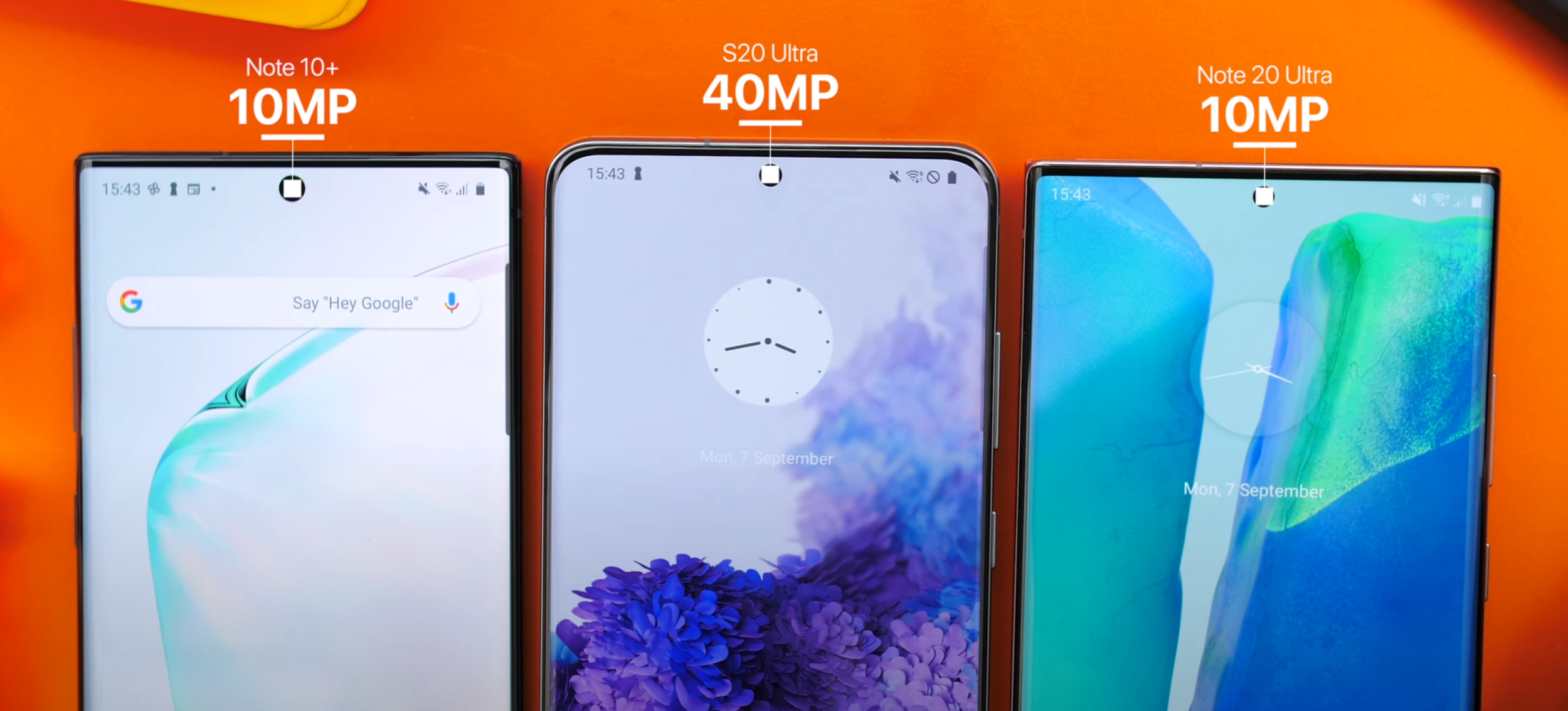
The Front Camera is unchanged from the Note 10+ from last year, but it can do 4K60.
Finally, the third Module on the back is the Ultra Wide Angle Module, which is identical to the one on the S20 Ultra. It’s 12MP in Resolution, with an f/2.2 Aperture Lens. Combined with the new and improved Image Processing, we get the most impressive Ultra-Wide Angle shots that I’ve ever seen on a Phone, even more impressive than on the iPhone 11 Pro Max. Aside from this, I absolutely love the fact that you can take Night Mode shots using any of the Lenses.
Samsung has now added a Pro Video Mode, which is amazing for Mobile Video Shooters, but you can only use it with the Main Module and not the Telephoto or the Ultra-Wide for whatever reason. The same thing applies to the Pro Photo Mode.
That’s a big issue for me and then another big issue is that you cannot record 4K60 Video from any of the other Modules, you can only do 4K60 from the Main Module on the back. What’s worse is that not only can you not switch between Lenses when shooting Video, but even when you’re not recording, if you want to see all three Lens options, you need to go into the Camera Settings and drop the FPS to 30. Samsung, please just release an update where we can still see all three Modules and if we select the Ultra-Wide or the Telephoto, the Frame Rate gets automatically capped to 30. I hate having to go into the Settings.
As long as I have to disable 4K60 for all but one of the three Lenses on this Phone, I cannot call this a 4K60 device. I ended up just leaving it set to 4K30, which is of course not ideal.
The Front Camera is good, it has too dropped in Resolution to a 10MP Sensor, the same Module as on the Note 10+ from last year as opposed to the 40MP Module that the S20 Ultra got. The Front Camera Cut-out is now smaller than on the Note 10+, so I do really like that. Selfies are still sharp, very well exposed and HDR Processing on the front is surprisingly well done. Additionally, the Front Camera can actually do 4K60.
Overall, the Main Camera Module is very good, only suffering from some occasional Dynamic Range issues, but nothing as severe as what the S20 Ultra had. The Zoom Module is the best I’ve seen on any Smartphone so far and the same goes for the Ultra-Wide Angle Module. My only major complaints here are not being able to use the Pro Modes on any of the non-Main Lenses and not being able to do 4K60 Video on all the Lenses on the back. Oh, and 8K Video Recording is still a gimmick, as it’s still capped at 24FPS.
Performance
Moving on to the Performance, this is where I have some pretty unfortunate news. As you may be aware, there are different configurations of this Phone, which depend on which region you’re in.
Some units come with the Exynos 990 Processor, mainly the ones made for the International market, while some units come with the much better Snapdragon 865+ Processor. This not only gives you 20% better Performance, which is a very gigantic difference, but it also runs cooler while giving you a better Battery Life. That’s absolutely nuts!

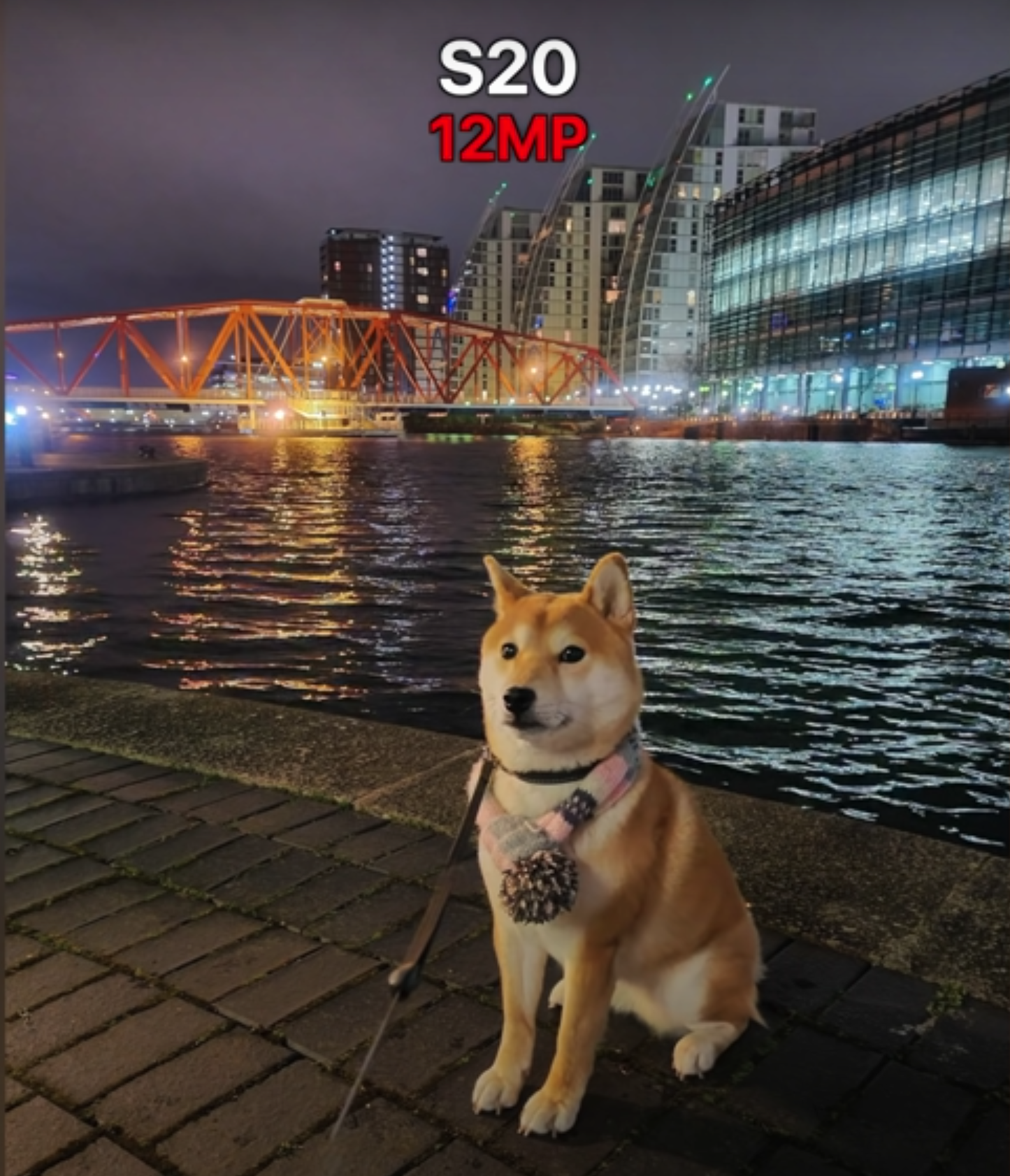
The drop in Frames between the two models (credit: XEETECHCARE)
Even with the S20 line, there was a lot of backlash from consumers on the fact that the Exynos 990 models were slower, ran hotter and had a worse Battery Life than the Snapdragon 865 models. But now with the Note 20 Ultra, Samsung has bridged that gap even more by including the even more powerful Snapdragon 865+ variant in the US variants, while keeping the international models with the same Exynos 990. Not only that, but JerryRigEverything and iFixIt have both found that Samsung even uses two different cooling systems in the Note 20 Ultra’s, some copper based and others Graphite based. Probably the worst part is that in some regions, like India or Pakistan, you actually get less RAM (8GB compared to 12GB), while in the US you only get 128GB of base Storage, as opposed to 256GB like you get everywhere else. Long story short, it’s a mess!
The Note 20 Ultra is the Frankenstein of all Phones and depending on where you buy itfrom, you’ll end up with some very different components, some of which are inferior. Our model is the Exynos 990 version, with 12GB of RAM and 256GB of Storage. Personally, I haven’t really had any Performance issues on this, it’s been running perfectly smooth, but what I have indeed had issues with, was overheating.
On a number of occasions, I’ve found that my Note 20 Ultra was running so hot that I could barely even hold it in my hand. At one point, it was just sitting in my hiking back, I took it out and because it was constantly searching for a signal, it got so hot that I had to literally put it back in my backpack as I couldn’t even have it in my jeans pocket. This overheating, combined with the already weaker Performance of the Exynos 990, results in games getting up to 20FPS less on the Exynos variants, when compared to the Snapdragon 865+ model.
Luckily, I’m not a big gamer myself, but it is very frustrating knowing that you can get an inferior Note 20 Ultra depending on the region that you’re based in, while not necessarily paying less for it.
Special Features
Moving on to Special Features, the Note 20 Ultra is literally packed to its teeth with features. You cannot get a Phone that’s more equipped than this.
Water Resistance, Wireless Charging, Reverse Wireless Charging, 5G and a Haptic Engine that now seems even better than the one on the Note 10+ from last year, resulting in one of the best typing experiences on a Smartphone. It also has some great, powerful Speakers. The Note 20 Ultra offers basically anything that you can think of.

The S-Pen is a major selling point for the Note 20 Ultra
But the main reason why you would want to get a Note over a standard Galaxy S Phone, or any other Phone for that matter, is the S-Pen. Samsung offers the best stylus experience on a Phone and the Note 20 Ultra is now even better than the Note 10+. The latency is now lower, at just 9ms down from 45ms, so everything feels incredibly smooth and pretty much just like writing on a piece of paper. There’s also a predictive algorithm now to make things even smoother, but I have noticed that sometimes it does indeed make the line jump, so I do think that it needs a bit more tweaking. There are a few new air gestures that the S-Pen supports now, allowing you to go back, go home and open up the multi-tasking menu just by using the S-Pen in the air, which is pretty cool.
I’m not a big hand-written notes taker myself, but where I have found myself using the S-Pen a lot was when using Photoshop or Lightroom. Being able to just use it as a brush or even as a small pointer to adjust the tools and brush size was absolutely amazing. However, because of that massive Camera Module, you cannot really use the S-Pen while the Note is flat on the table because of how much it will wobble, which I think is a massive downgrade to the S-Pen experience overall.
But something that is actually a big upgrade, is in terms of DeX. DeX being this Desktop UI that Samsung Phones will boot in once you connect them to an External Monitor. It’s an extremely underrated feature. Now, the Note 20 Ultra supports Wireless Dex, meaning that if you have a TV that supports the latest version of MiraCast, you can cast directly to your TV and then use your Samsung Phone as a Trackpad and Keyboard. You could also hook up external peripherals and kinda use this as your Desktop replacement to some extent.
You can run the Desktop version of Chrome as well as Microsoft Office so for some people, DeX can indeed replace their Computer. You can also open up all of your Android Apps in windowed and full-screen. I am a big fan of DeX, even though I don’t personally use it as much.
Software
When it comes to the Software Experience, the Note 20 Ultra runs on Android 10, with Samsung’s OneUI 2.5 Skin. I have to say, TouchWiz from back in the Galaxy S4 and S5 era was the most infamous Skin on any Android Phone, it was slow and laggy. OneUI 2.5 is for me at least, the best Skin on any Smartphone right now.

This is one of the best skins we’ve seen on any Android Phone.
It’s very fast, very fluid. The design is great and the reason why it is called OneUI is because you can use it with one hand, to some extent at least. My favourite part about OneUI is that you can have App Folders in the App Drawer too. This way, you can have a very minimalist Home-Screen while also having App Folders easily accessible for when you need them.
Also, Samsung allows you to run three Apps at the same time, with one being a picture-in-picture overlay, which makes this Phone, in combination with the S-Pen, one of the best Smartphones for productivity work. You can lock Apps in memory, you can have YouTube Player in the background in a tiny pop-up window if you have YouTube Premium, it’s just so good.
But…it’s not perfect. It does have some occasional Frame Rate drops when it comes to animations and I’m not a fan of the way Notifications are displayed at all. Some end up being in non-chronological order. In my case, where I get hundreds of Notifications per day, which I cannot really disable, it ends up being a complete mess and really difficult finding what I’m looking for.
Battery Life
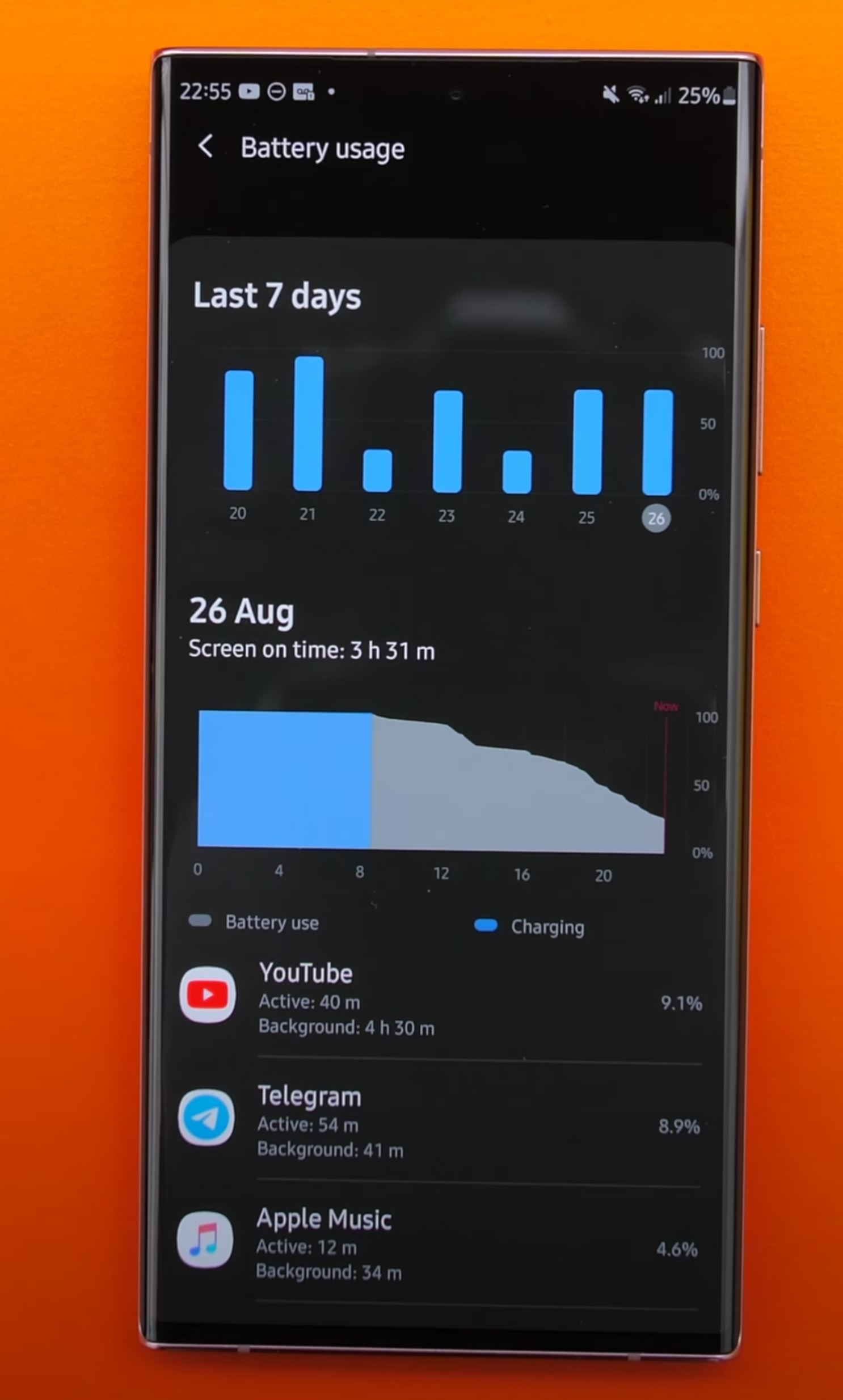
Battery Life is not a strong point for the Note 2 Ultra
The Note 20 Ultra come with a 4500mAh Battery, this is 500mAh less than the S20 Ultra came with. But, we do have that LTPO Display, which does indeed save some Battery Life. From my usage, it was just about the same as on the S20 Ultra. But that doesn’t mean it was great.
I was getting about 3-4 hours of screen-on time, which was pretty bad, even after multiple weeks of use. On my Fold 2 for example, I’m easily getting around eight hours or so. I do have the Exynos variant and have heard that the Snapdragon variant isn’t quite as bad, but the Exynos variant is just not as good as it should be. Luckily, we still have Fast Charging but this has now dropped to 25W from 45W, like we had on the S20 Ultra. The good news is that it still charges to around 50% in just 30 minutes, so I don’t have any complaints in terms of that.
Value
So in the end, is the Note 20 Ultra actually worth it? Well, I can confidently say that if you’re looking for a non-foldable Smartphone, this is the best one that you can buy. You get an outstanding Display, an incredible Design, great Cameras and all the features that you can think of.
But, you will have to pay for all of that. At a starting price of $1,300 or £1,180, the Note 20 Ultra costs as much as a pretty good Laptop and it isn’t that far off from the Galaxy Z Flip, which costs £1,300. You can even find the original Galaxy Fold for about £600-£800 or so, on eBay.
At that point you’ll have to decide. Do you want the ultimate standard Smartphone experience or do you pay a bit more and get into the Foldable Smartphone market? If you do decide to go for the Note 20 Ultra, try to get the Snapdragon 865+ variant as you’ll get a better Battery Life, more Performance, a better Gaming experience as well as a cooler device.