
Every year in June, Apple announces a new version of iOS, iPadOS, watchOS and macOS. We also have tvOS but come on, no one really cares about that.
This year, we had a few leaks that iOS 14 would bring a new Fitness App to the table, alongside possibly a new list view for the Home-Screen, but that was pretty much it. However, it turns out that iOS 14 is actually pretty much the biggest change that the iPhone has had since the introduction of the very first iPhone, back in 2007. This version of iOS (4) brought the ability to change the Wallpaper, as well as multitasking support. Then, iOS 7 redesigned the whole look and now iOS 14 allows you to have more than just Icons on the Home-Screen.
It introduces Widgets and an App Library UI, amongst many massive features, making it a gigantic update. I’ve already covered over 40 big changes in our previous video, but now that I actually got a chance to use iOS 14 on my actual iPhone for a few days, I wanted to talk about my personal experience and how it actually is to use iOS 14, iPadOS and watchOS 7. So, without further ado, here is my iOS 14 experience!
iOS 14
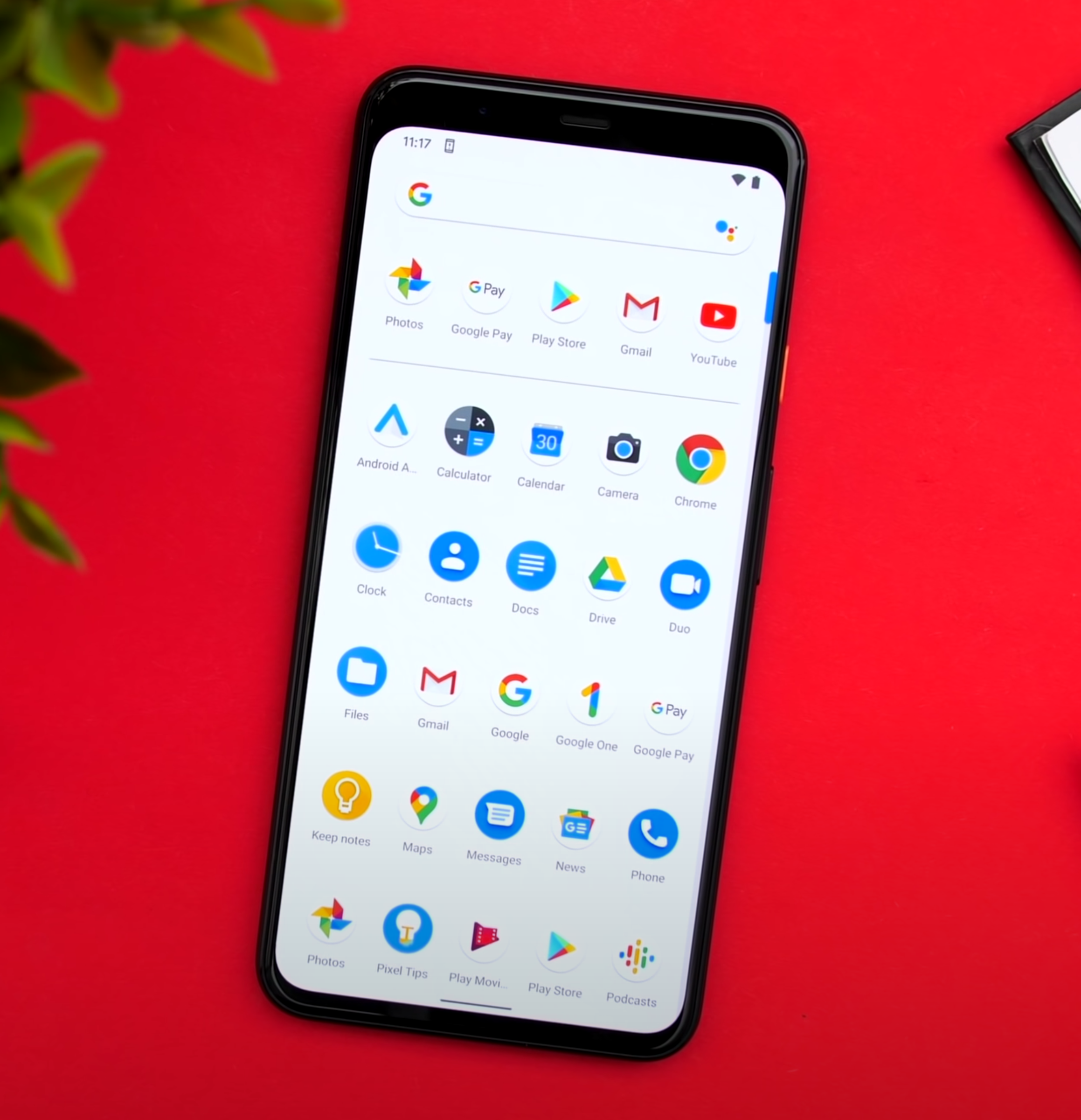
Starting off with iOS 14 and the biggest feature that we got were the Home-Screen Widgets.
Now, we did kind of have Widget support with iOS 8, which came out in 2014. But these Widgets were only viewable in the Notification Centre. In more recent versions of iOS, you had to swipe right from the Home-Screen in order to see them, which was not that convenient. But now with iOS 14, you can place Widgets pretty much anywhere you want on the Home-Screen, which reminds me of Android.

This is so much cleaner, on the face of it.
In fact, Widgets support has been my number one most requested feature in iOS and it’s been one of the major reasons why I keep gravitating towards Android, whenever a major new device comes out. However, unlike on Android where you can basically place a Widget anywhere you want, on iOS they work in the same way as Apps do. They still magnetically attach to other Apps, which means that you just cannot have Widgets on the top, empty space in the middle and Apps on the bottom. You can only place Widgets where you already have Apps, which is a bit of a bummer.
Also, you always need to have two rows of Apps between Widgets. For whatever reason, you just cannot have one single row, probably because Apple is using a 4x4 App Square for each small Widget. Something cool that I’ve noticed is that now you can just hold your finger anywhere on the Home-Screen to activate the Jiggle Mode, this is what it’s called internally. You also get this nice Haptic Response when you’ve done that.
In order to add Widgets, you just press on the ‘Plus’ Button in the top right corner, you then get a bunch of automatic Widget suggestions, based on the Apps that you use the most. Once you scroll down, you get to this list of all the Apps that support Widgets. Since the Widget system has been completely redesigned in iOS 14, Apps will need to implement these Home-Screen Widgets, which is the reason why right now, only a few First-Party Apps support them. But then, it’s pretty straight forward. You select a Widget and then you get to choose between three or even four different sizes, in the case of Notes. Unfortunately, you cannot resize a Widget once you’ve placed it. In order to change the size of it, you’ll have to remove it and add it again.
Now, if you choose to go for a small Widget, then that Widget would not be intractable. The moment you tap it, you would be taken to that App. Whereas if you have a larger Widget, with more UI elements, then you can click one of those elements to get taken to that specific function in the App. You can also hold on a Widget and then edit it with things such as changing the location that the Weather App shows you, the Note that’s currently displayed in the Notes Widgets and so on.
You can also drag one Widget on top of another, to have a stack of multiple Widgets that you scroll through. It might be useful for some users, but for me personally, I like having all my information visible at a glance. I do prefer having all of my Widgets un-stacked and visible all the time.

Yes, ‘Jiggle Mode’ is the actual term for it.
Overall, I really do like the Home-Screen Widgets a lot and I just cannot wait for more Developers to start creating their very own Widgets. I predict that I would be changing my Home-Screen almost daily when that happens, by playing around with different Widget layouts. But unfortunately, Widgets are far from perfect.
You cannot position them anywhere on the Home-Screen, for some reason Apple still kept the previous Widget View from iOS 13. Meaning that you can still swipe right from the Home-Screen and get this very long scrollable list with all of your Widgets. I just think that they should remove this because it just complicates things way too much for the average user. Having two places where you can have the same Widgets is just not ok. But wait, it gets even weirder.
In the Widget Panel, you can still hold to make them jiggle and then you have the same ‘Plus’ symbol, from where you can add more of them. It turns out that if you scroll down you still have the ‘Edit’ Button, from where you can add all the iOS 13 style Widgets here. Now, I really do hope that Apple fixes this in a future Beta Version. I do think that it will be fixed by the time iOS 14 launches, especially since all Widgets will be converted to the new style.
The second big new feature in iOS 14, is the App Library. Just like on Android again, where this is called the App Drawer, if you swipe left from your last Home-Screen, you can access the App Library, which is really just like the Launcher on Mac. A collection of all of your Apps installed on your iPhone. While I do like this idea a lot, unfortunately there are many issues and inconsistencies that I’ve found with the App Library. For example, on stock Android you get this App Drawer which lists and sorts all of your Apps alphabetically. Personally, I’m not really a fan of this as I do prefer having my Apps in Folders, which Samsung actually allows you to do in their own Android skin. which I love. Apple is somewhere in the middle.
The App Library does create App Folders, but those Folders are created automatically for you. There’s no way you can change that which means that finding a specific App can be quite tricky. Apple, please give us the option to rename and organise the Folders, as that would help a ton!
Another mainstay on Android has come to iOS in the form of the ‘App Library’.
The way it works now is kind of pointless as I can still better organise all of my Apps, by having custom Folders on the Home-Screen. Also, opening those Folders in the App Library is very confusing as well. Unlike the Folders on the Home-Screen, if you tap on an App, it just launches it. So, you need to press on the bottom right Icon that shows multiple Apps, in order to open up the Folder. Ok, so you’re probably wondering, what happens if you delete an App from the Home-Screen? Does it go to the App Library or does it get removed? So, once you get into Jiggle Mode, the ‘Delete’ option has been renamed into ‘Remove App’ and once you press that, you’ll be asked if you want to delete the App or add it to the App Library. Which again, is extremely confusing because all your Apps are already in the App Library anyway. I think this should be renamed into “Hide App” and “Remove App”.
Back to the App Library. If you swipe up, you get this list view in alphabetical order, with all of your Apps. This is sort of like on Android and then you can scroll through them or even search through them, which I can already do that in Spotlight Search, but at least we get this list view, which I am a fan of. Those are the two big changes in iOS 14, Widgets and the App Library. While I do love both, I do feel like iOS is becoming a bit of a mess now. You can swipe right to access the Widget Panel which you can also add to your Home-Screen anyway. You can then swipe down to access the search functionality which you can also access by swiping left from your last Home Screen, but that search is only for Apps, whereas the swipe down search is for everything. I just feel like it needs a lot of polish as right now, it’s like a notebook full of ideas, instead of an organised Operating System.
There have also been a few extra things that I have noticed, which I do really want to point out. First off, the stability has actually been very good. I haven’t had any system crashes or anything really. It was a bit slow at first but after it indexed all the Apps, things got back to normal. It was so good that I even installed it on my personal iPhone and from all the Betas that I’ve used over the past ten years or so, iOS 14 is definitely the most stable. Battery life has been affected, but it’s nothing too severe.
The double-tap on the back functionality allows you to select a specific function that your iPhone will execute, once you double or triple-tap on the back. The way it works is that it uses your iPhone’s motion sensors to detect the tap on the back. However, because of this, my double tap functionality also got activated a few times when I laid my iPhone flat on my desk. The good news is that you can also have custom Siri short-cuts on this, meaning that you can pretty much assign anything you want to this double or triple tap Gestures. I’ve set mine to launch the Camera App as iOS still doesn’t have a quick Camera Launch functionality on the Volume or the Power Button. These gestures are a bit finicky to activate, but when they do work, it’s a pretty nice feature to have.

A long-awaiting and welcome new feature, is 4K YouTube Content.
Also, you can finally watch 4K YouTube content now, after so many years.
The reason why we couldn’t do it before was because Apple wasn’t using Google’s VP9 Codec and Google wasn’t using the h.265 that Apple was using. But now that the new AV1 Codec has been agreed to by both Apple and Google, and iOS 14 supports AV1, 4K playback is finally possible on Apple devices. But there is a catch. Google only seems to be using AV1 for 4K HDR videos, meaning that you can only watch 4K videos that are HDR. Otherwise, they’ll still be 1080p. I really hope that this gets fixed.
Speaking of things that need to get fixed. There’s now a way to adjust the exposure in the Camera App separately from the Focus, which is pretty great! We’ve had this in some third-party Apps as well. However, the way it currently works in iOS 14 has to be the most unintuitive way that I’ve seen. You can still adjust it via the up/down Slider when you’re focusing, but now you also have this Exposure Meter. The thing is, once you adjust it, there’s no reset button and you can increase/decrease the Brightness the same old way while the exposure meter is set to a custom value and that value won’t change. However, I’m pretty sure that this is a glitch though.
In the Weather App, you can now see the AirQuality Index, which is pretty nice. Probably my favourite feature that I’ve found is that now you can hold the Navigation Buttons to go back to a specific previous category. This really helps for when you’re buried deep into the Settings and you don’t want to keep going back and back until you get to where you want to be.
Siri now has a brand new UI, which I do like. You can now summon her without blocking the entire Display. However, what I don’t like is that you cannot interact with your Phone, whilst using Siri. Other than that, it’s more or less the same Siri as before. This UI now applies to whenever you’re getting a call. Rather than this blocking your entire Display, you get this notification-style window which you can even dismiss and continue doing your own thing.
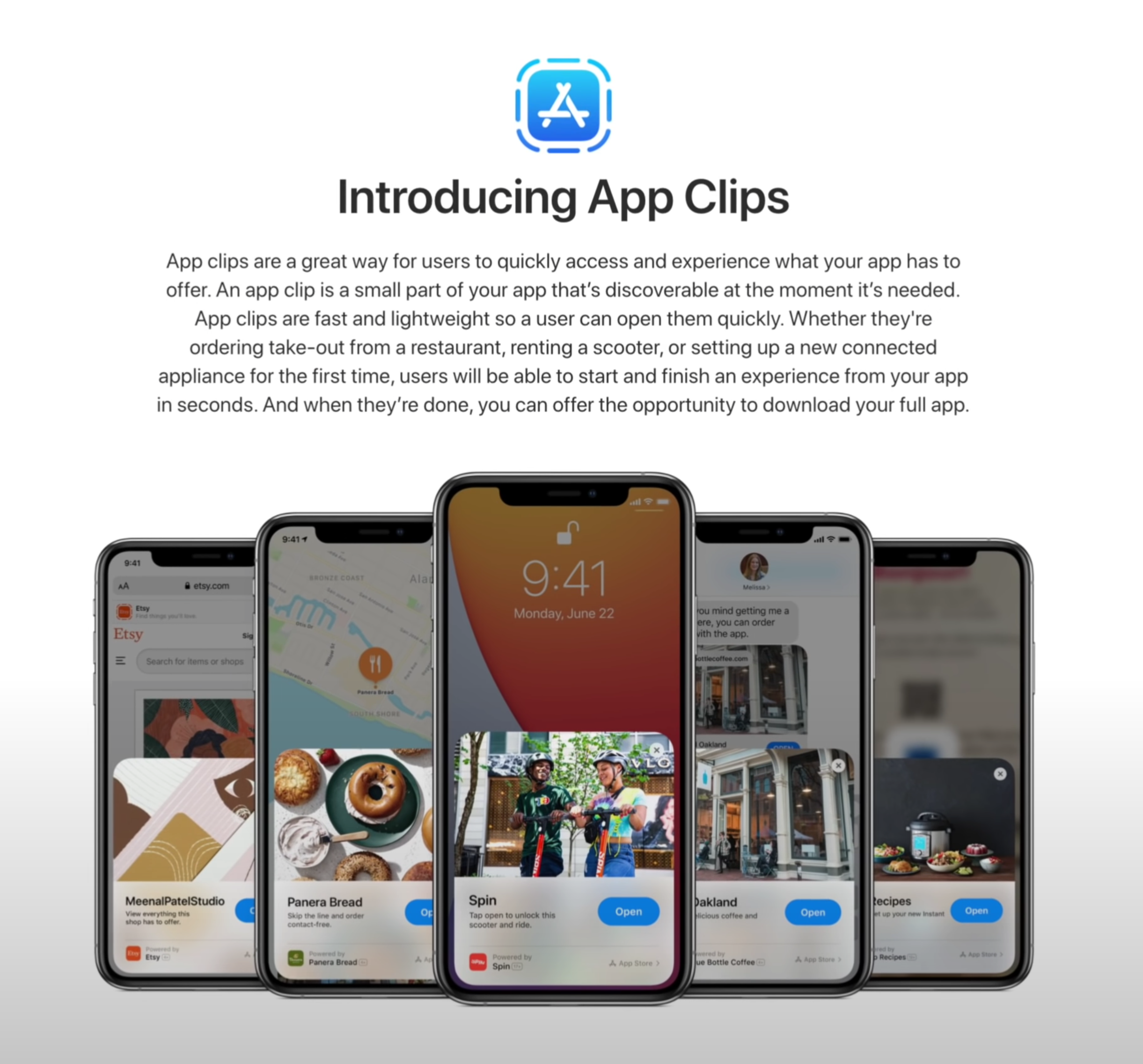
‘App Clips’ is another thing that we’re looking forward to testing in the future.
Control Centre now allows you to show individual Accessories and Scenes from the Home App. Unfortunately, you cannot customise which Scenes or Accessories it shows you as this has all been automated, based on the ones that you use the most.
If you’re wondering how the AirPods pro sound, with that new 7.1 Surround Sound support, I won’t be able to tell you that because it seems that this is not available in Beta 1 just yet. Picture-in-Picture is though and it works just as you would expect it to, kind of. It doesn't work in the YouTube App so you have to be playing a video in Safari in order for that to work. But, it does work for Face-Time now, meaning that the person that you’re speaking to won’t get a black screen every time you go to check a Notification, but instead they’ll get to see you all the time, ands likewise.
Of course, there are many more features, such as App Clips, which I cannot test just yet. In terms of the big changes that I have noticed, these would be the main ones.
watchOS 7
Moving on to watchOS 7, by far the biggest change here is Sleep Tracking and…I’m quite disappointed. The way it works is that you have this Sleep App and you select how many hours of sleep you want to get and when you need to wake up, it will then tell you when you have to go to bed. Right before that, you’ll have a ‘Wind Down’ period, which is usually around 45 minutes. This is when DND will automatically be enabled and that’s pretty much it.
Your Apple Watch will estimate the Battery Life it would have, when you go to bed, and if that amount would be less than 30%, you’ll get a Notification to charge it. The only problem is that I never got that Notification, which I’m assuming will get fixed in the final version. Not only that, but Automatic Sleep Detection never worked for me. I had to manually put my Watch into Sleep Mode, rather than this being enabled automatically based on the sleep times that I’ve set it to. Again, I’m guessing that this will be fixed when iOS 14 comes out.
But probably my main issue with Sleep Mode is that you cannot really see your sleep stats, unless you go into the Health App and into the ‘Sleep’ section of that. Moreover, it doesn’t even tell you much, just the time you were in bed, which is literally based on when you tapped the ‘bed-time’ Icon and the time you were asleep. There are no mentions of sleep quality, REM data or anything like that. An App such as Sleep Cycle is so much better than the native Sleep Tracking is, as of right now.

Native Sleep Tracking will now be a thing, but there are already alternatives that do it better.
Also, you’re probably wondering how much Battery Life it drains in Sleep Mode. Well, in my case, I had 51% Battery when I went to bed and 37% when I woke up about six-seven hours later. A 14% drop is actually very good, I just really hope that the Sleep Tracking gets smarter by the time this gets released.
There is a new hand-wash feature which would show you a timer when it detects that you’re washing your hands. That’s not working just yet, or at least I could never get it to work, on my Apple Watch.
Aside from that, the only new Watch-Face that we get, is the Chronograph Pro, which includes a Tachymeter that you can use to measure the speed that you are traveling at. I just wish this also had a digital version. You can also have complications on the X-Large Face, which is pretty nice to have and you can also add a Colour Filter to the ‘Photos’ Watch-Face. I also really do like how Apple has redesigned the Watch-Face customisation page and they now show you the colour selector on the right of the Face, rather than inside the Watch-Face.
There’s a new Workout for Dancing, but this was actually in watchOS 6. It was hidden in ‘Others’ and I’ve used it all the time for when I was playing ‘BeatSaber’. I’m not fully sure what’s new with this, possibly improved tracking? But that’s pretty much it in terms of big, noticeable changes.
iPadOS 14
Finally, there’s also iPadOS 14, which is a very small update. Aside from ‘Scribble’, there’s nothing really that stood out to me. In fact, we don’t even get the Widgets from iOS, there’s still stuck in the Side Panel and we don’t have the App Library at all, which is extremely inconsistent.
While I do believe that these will be added by the time iPadOS releases, Craig Federighi indicated to Marques that this is how they’ve intended to release iPadOS 14, for now. So, we’ll see.
But that’s about it, macOS does have a lot of changes as well, just like iOS 14 did, but that’s an entire video in itself.